Targa Pro: Italian plates, refined for print
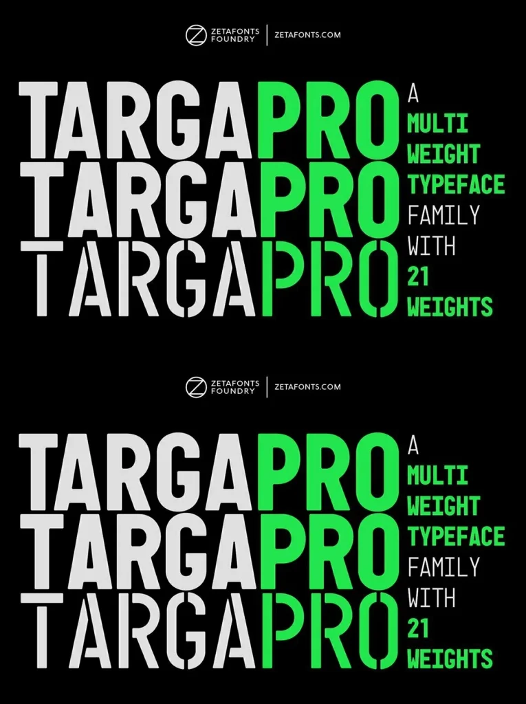
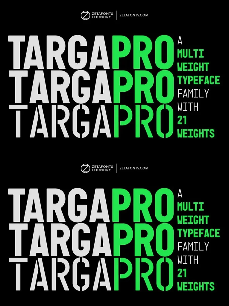
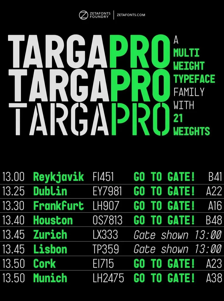
For many years, Italian license plates have used a distinctive sans serif monospace with slightly rounded corners, a geometric structure, and a condensed skeleton. Cosimo Lorenzo Pancini drew on these letterforms for Targa, published as the first-ever Zetafonts typeface in 2003. Almost twenty years later, Francesco Canovaro revisited the project for a complete redesign—keeping its key inventions, solving its issues, and developing it into a versatile, multi-weight typeface.
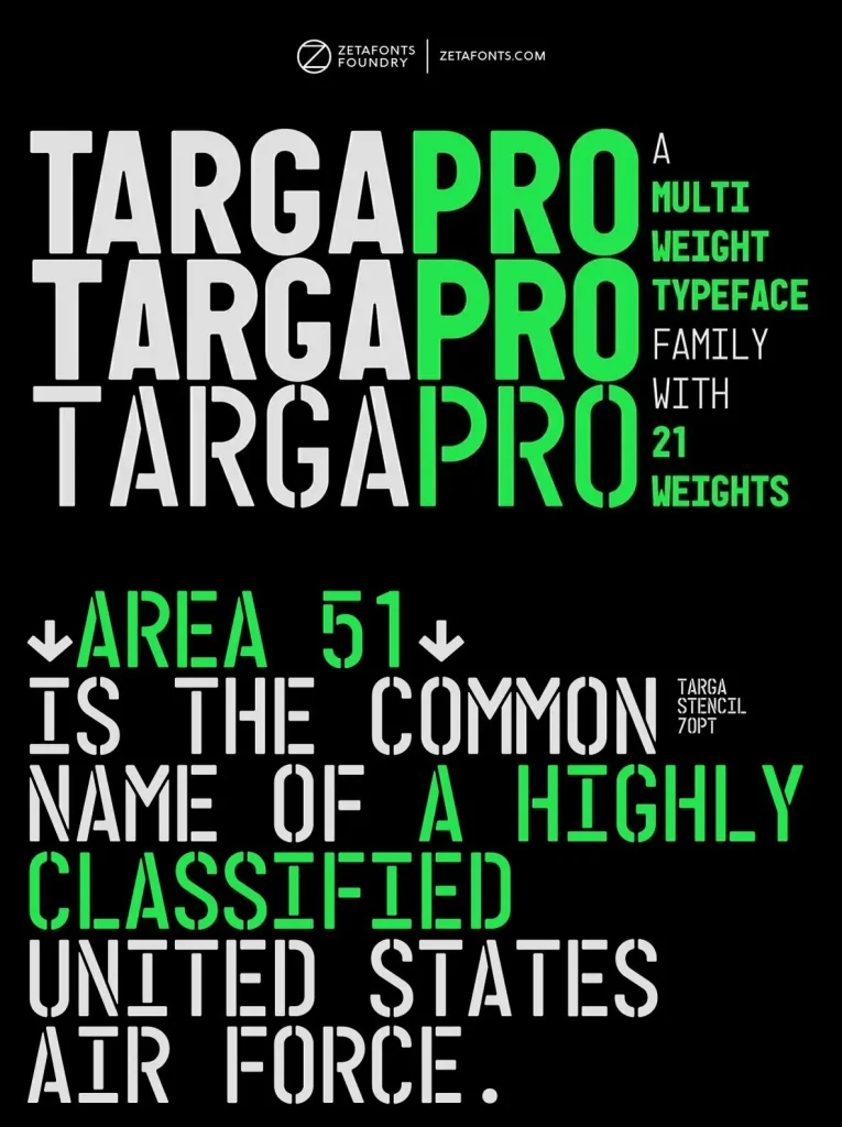
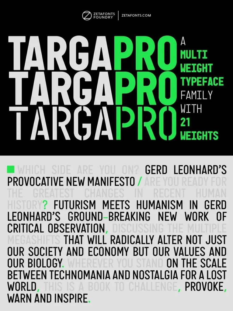
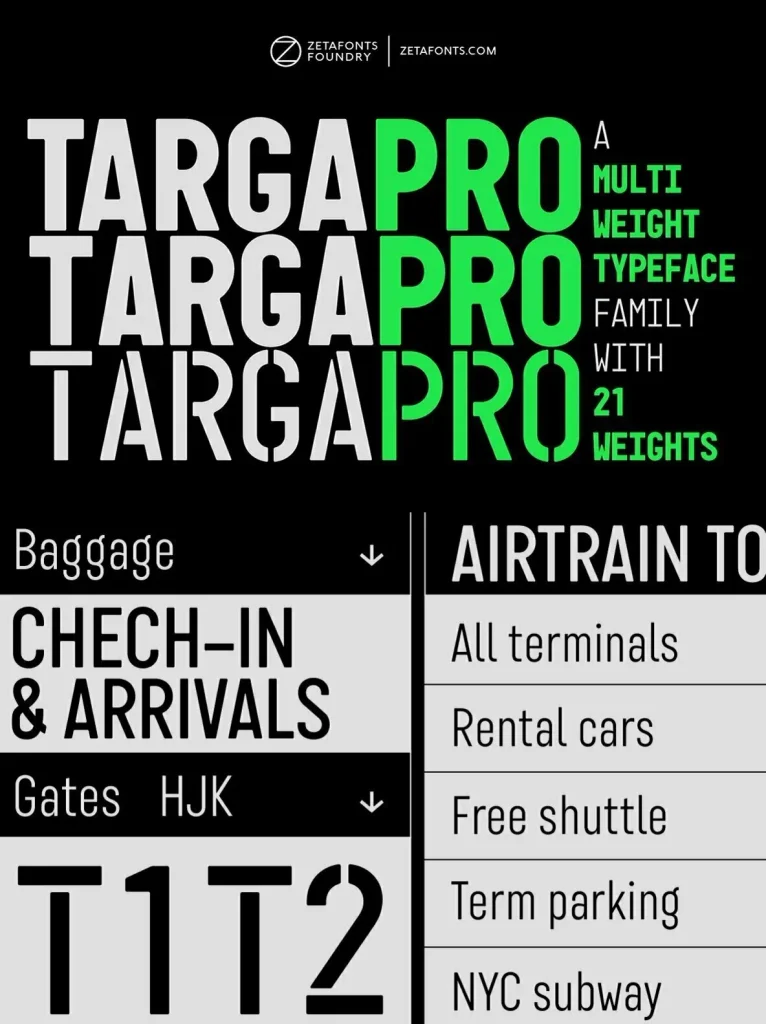
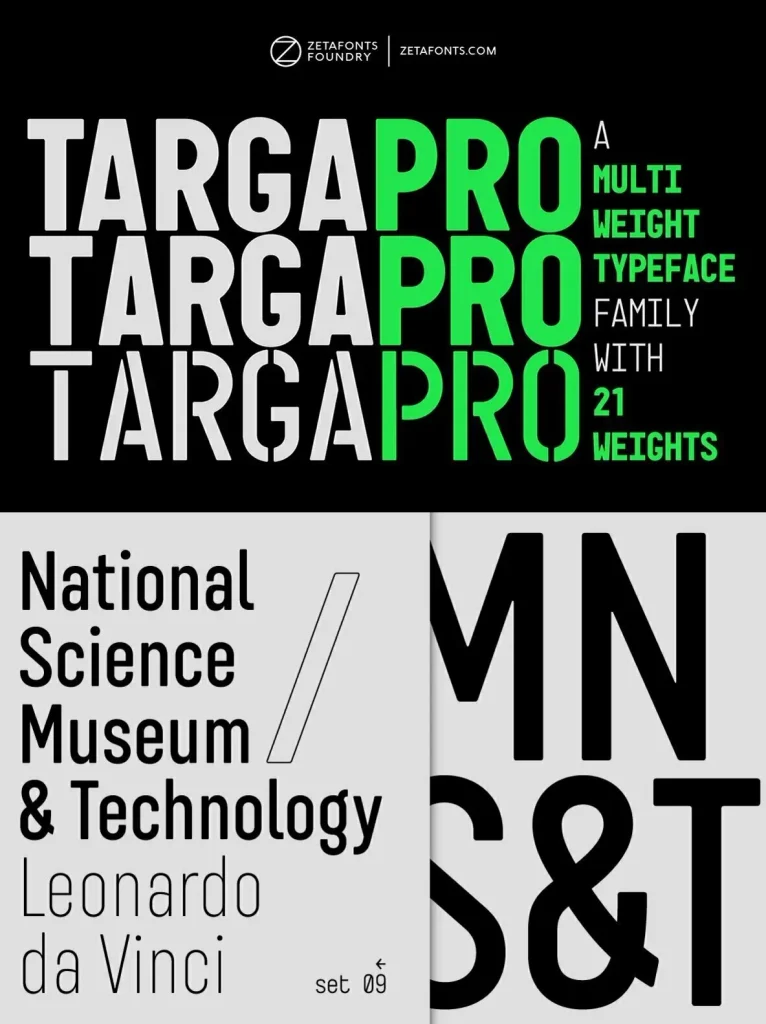
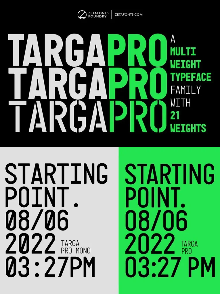
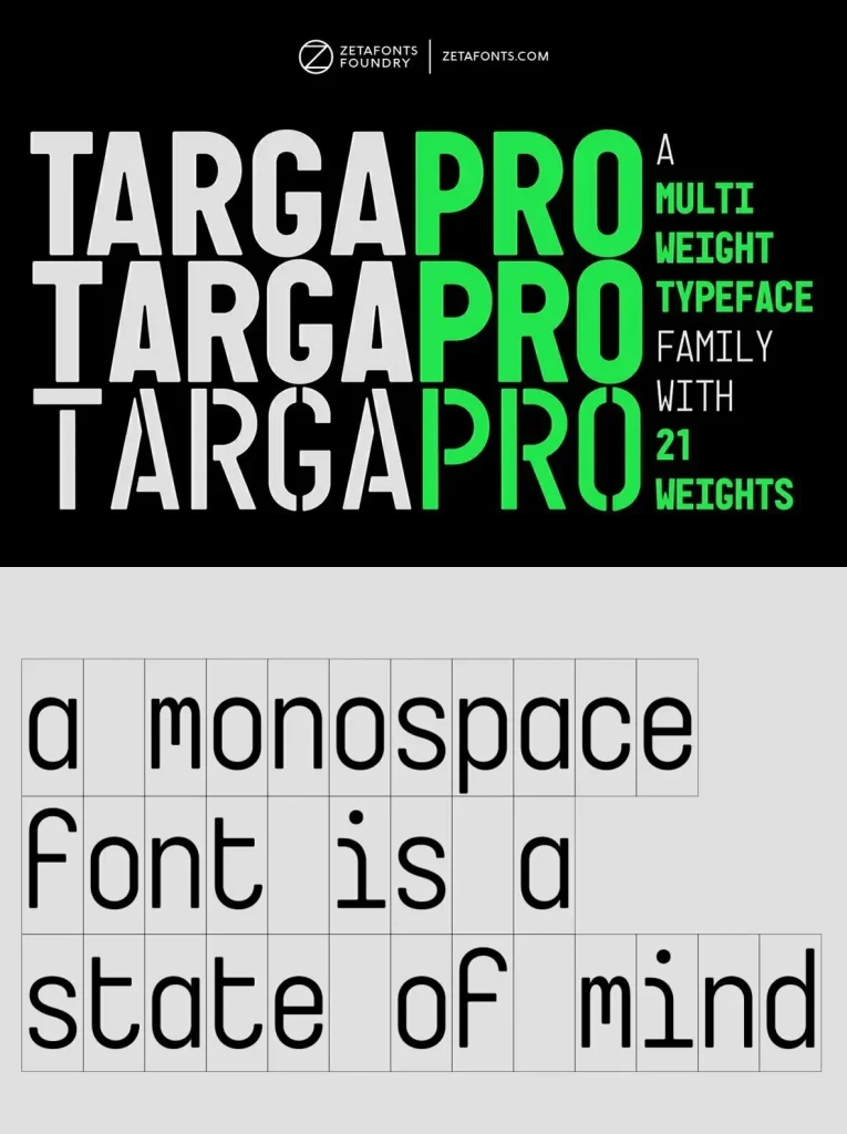
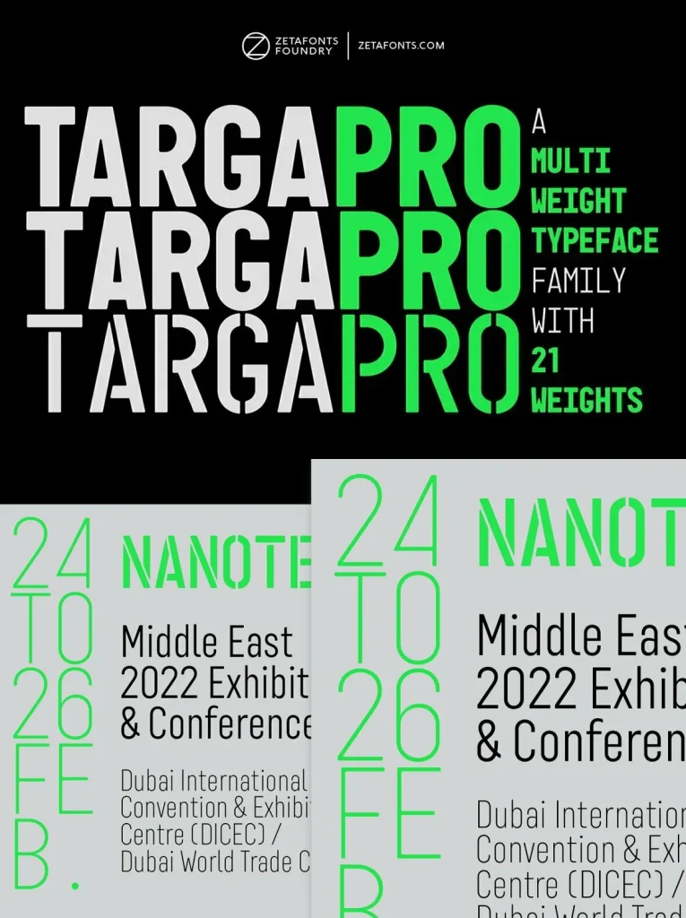
The family now comes in two subfamilies: Targa Pro Mono, which preserves the original monospace widths, and Targa Pro Roman, with proportional widths. Both include five weights plus italics. The original also included the handmade Targa Hand, now paired with a new Targa Pro Stencil for added choice and flexibility in display typography.
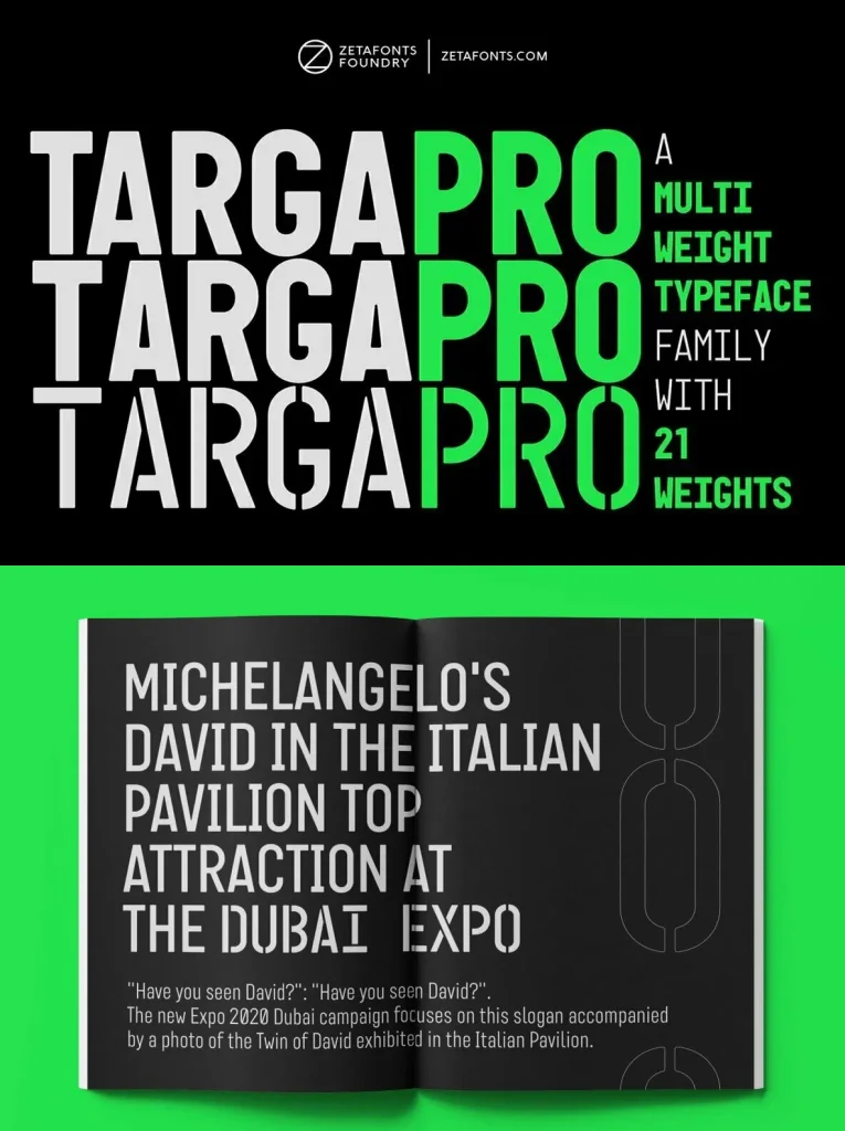
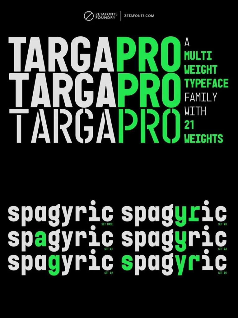
All weights of Targa Pro include an extended Latin character set covering over 200 languages, along with a full set of OpenType features, including positional numbers, alternates, and stylistic sets. Balanced between postmodern appropriation of utilitarian design and rationalist design, it brings quirky Italian flavour to contemporary work—equally at home in artificial nostalgia and modernist functionality.