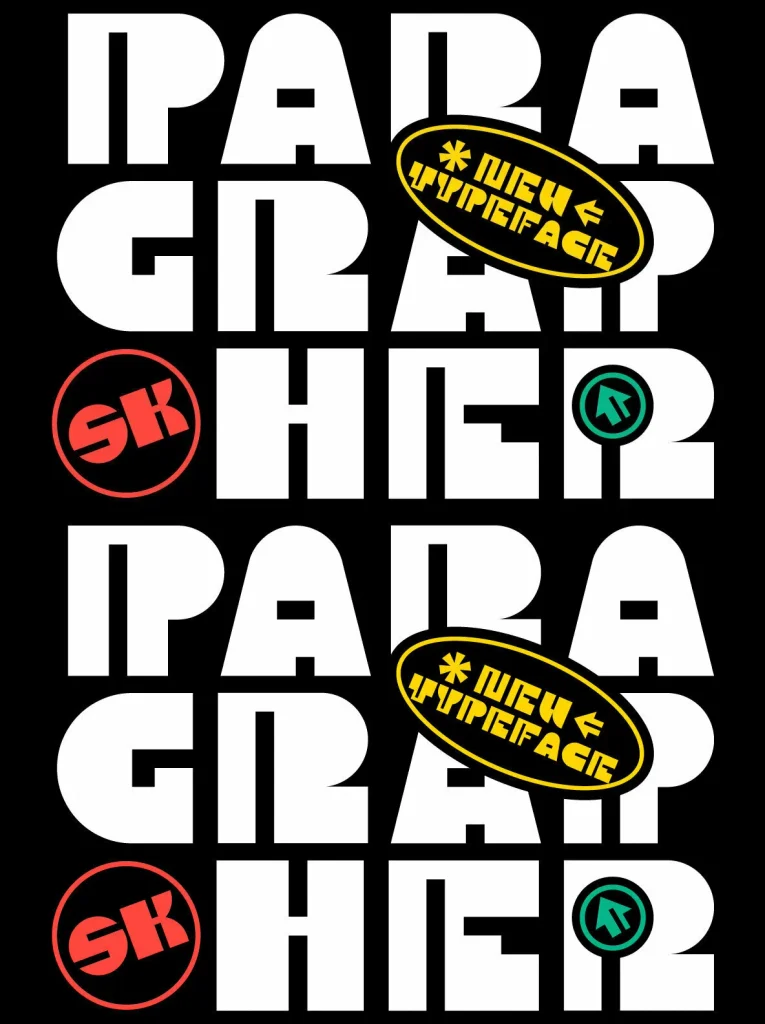
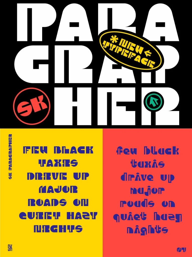
SK Paragrapher — Monumental rhythm, grid precision
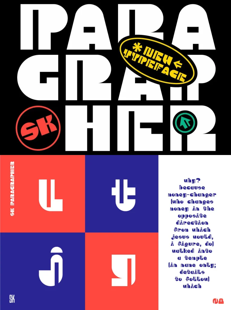
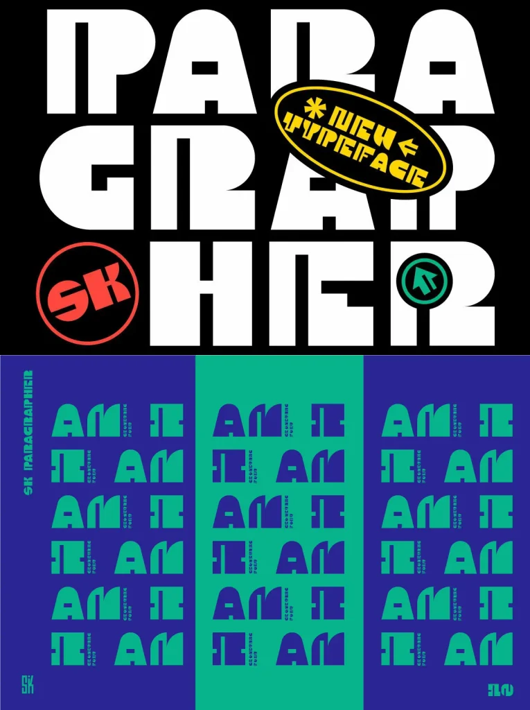
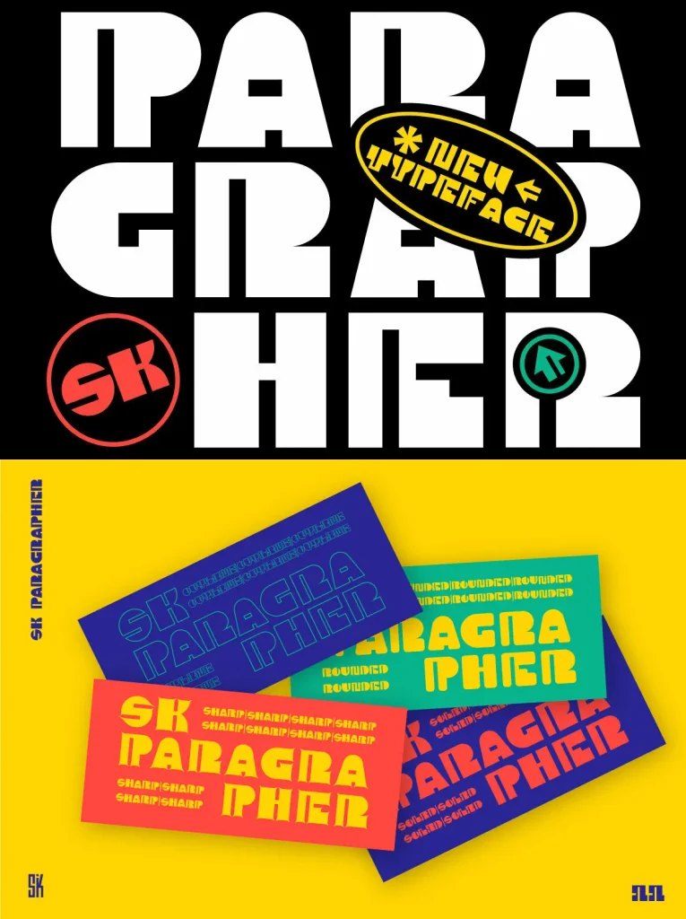
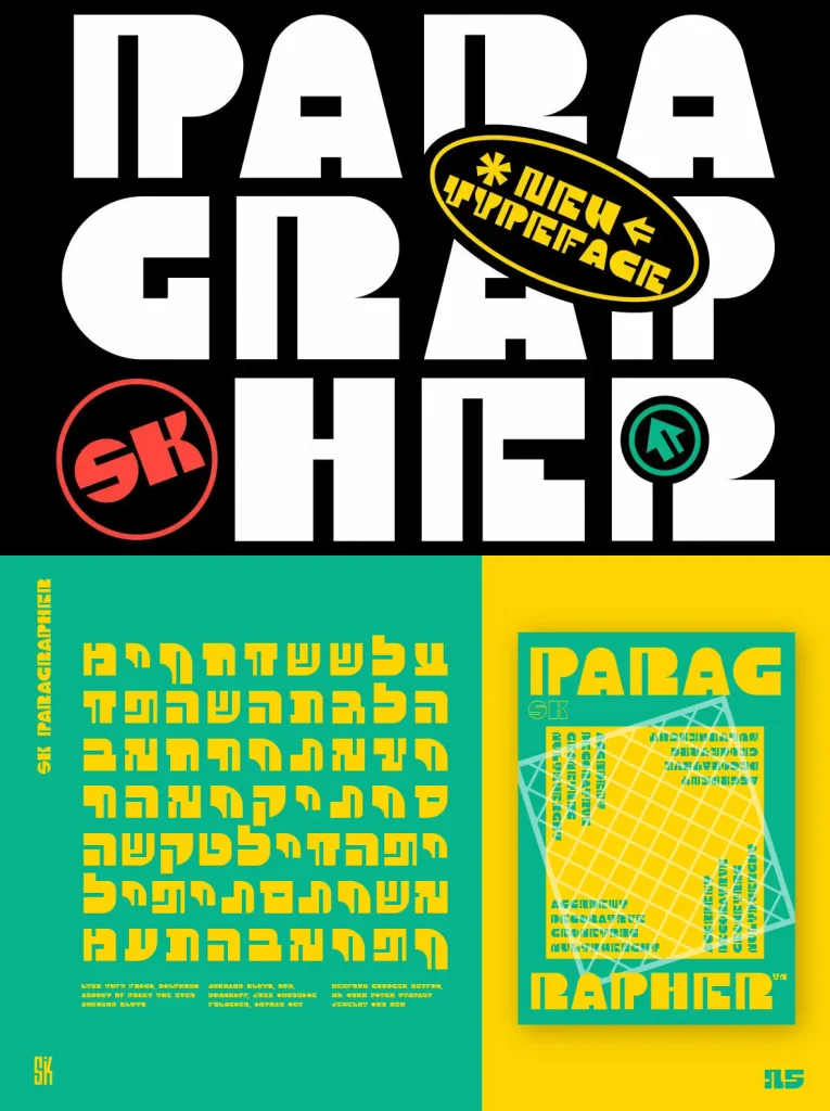
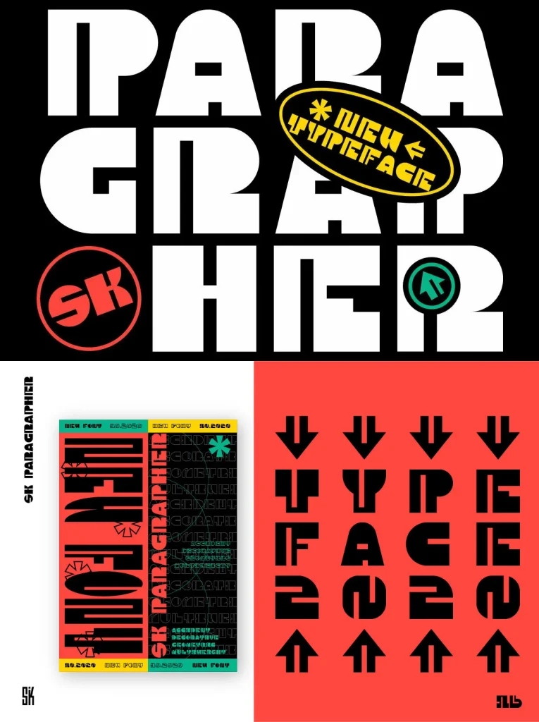
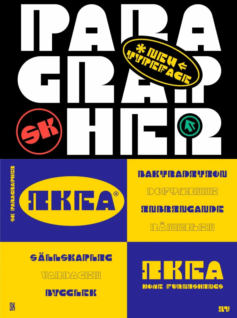
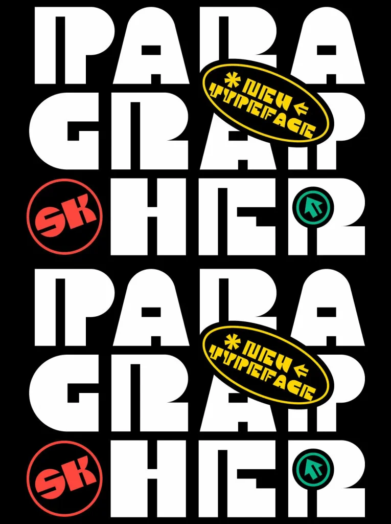
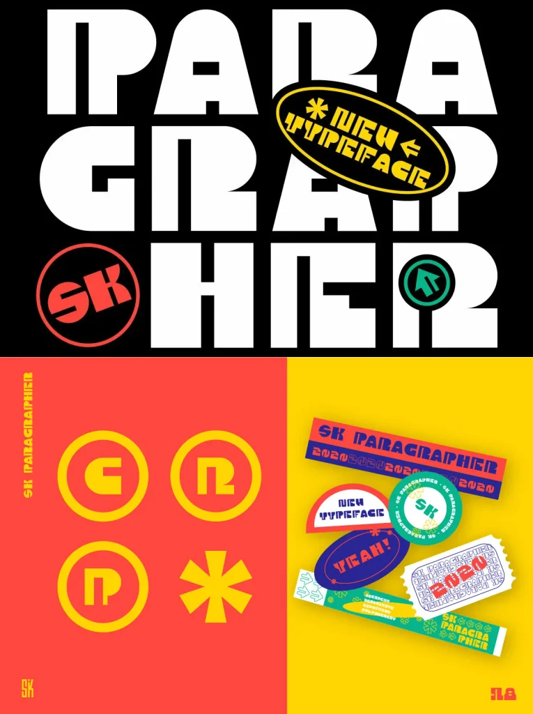
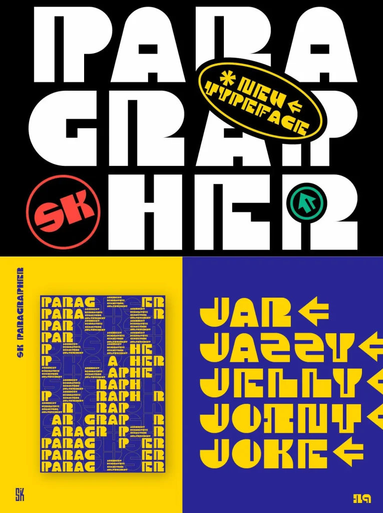
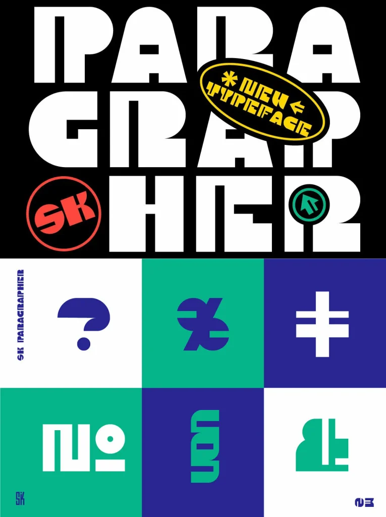
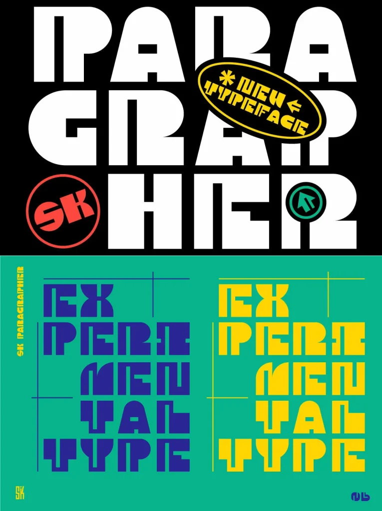
A monumental geometric typeface inspired by the paragraph glyph. Its structure follows a rhythmic composition and a careful black-to-white balance, giving the design a measured, architectural presence. Each character corresponds to a grid, and every character is monospaced, so layouts stay harmonious and complete—even with the typeface’s complex visual logic.
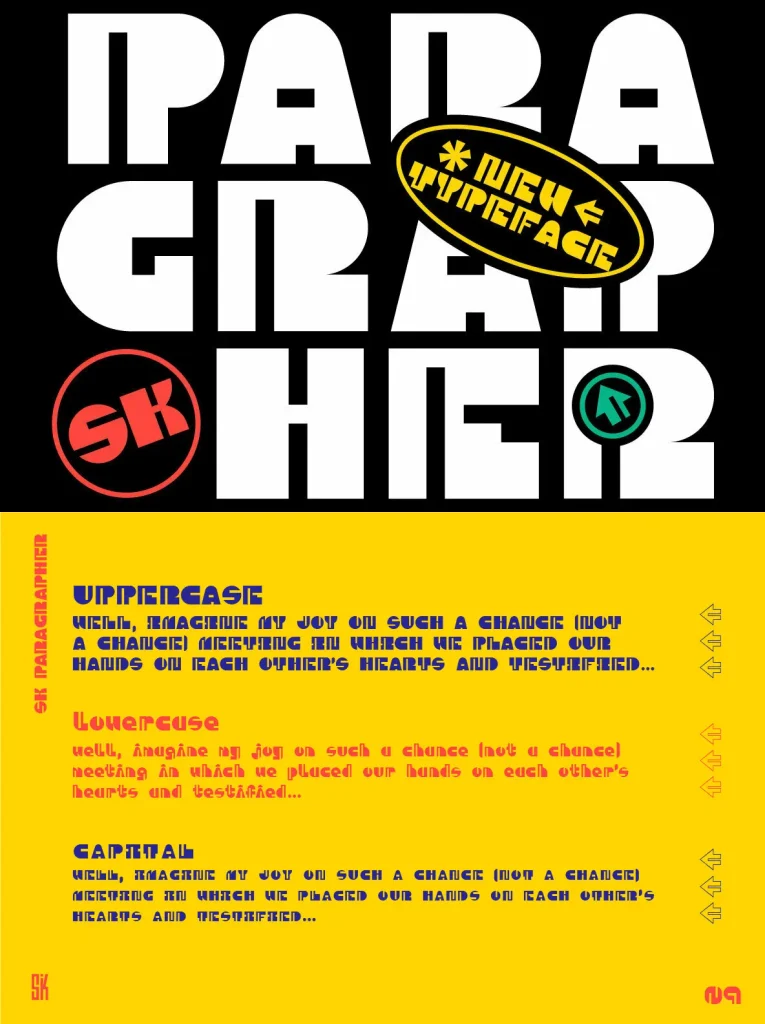
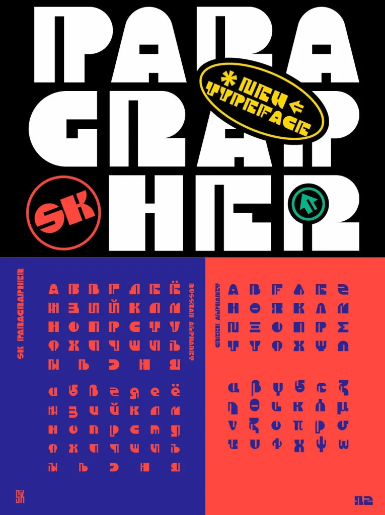
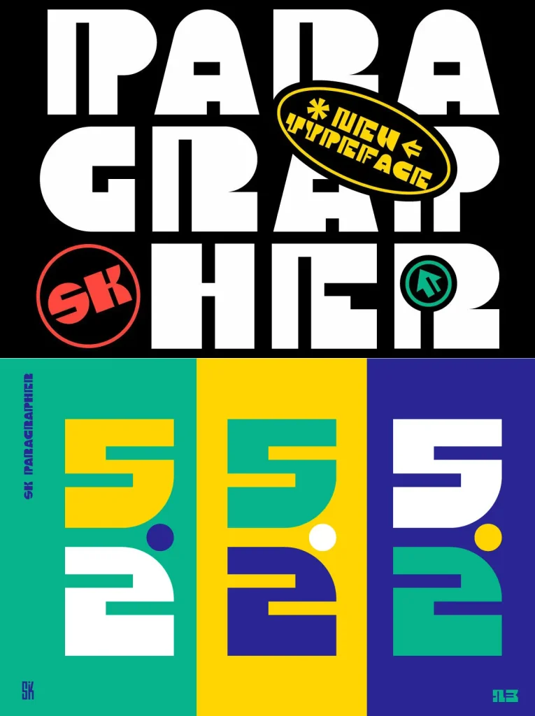
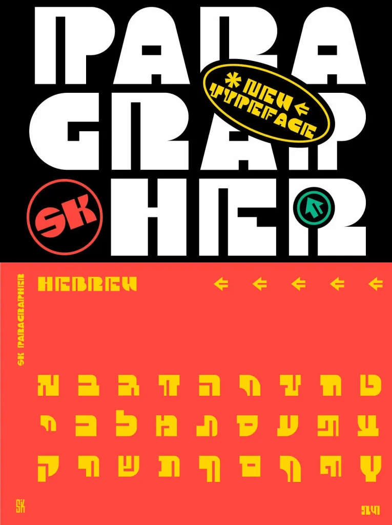
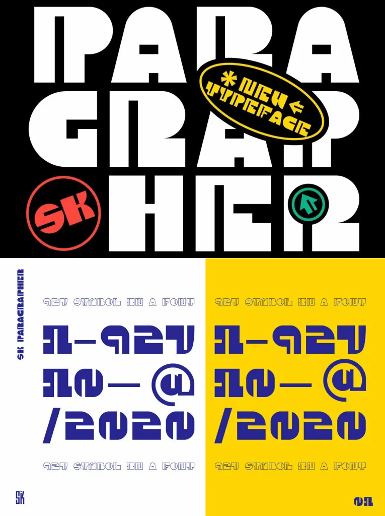
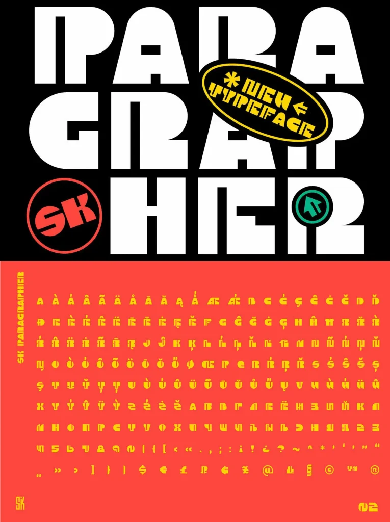
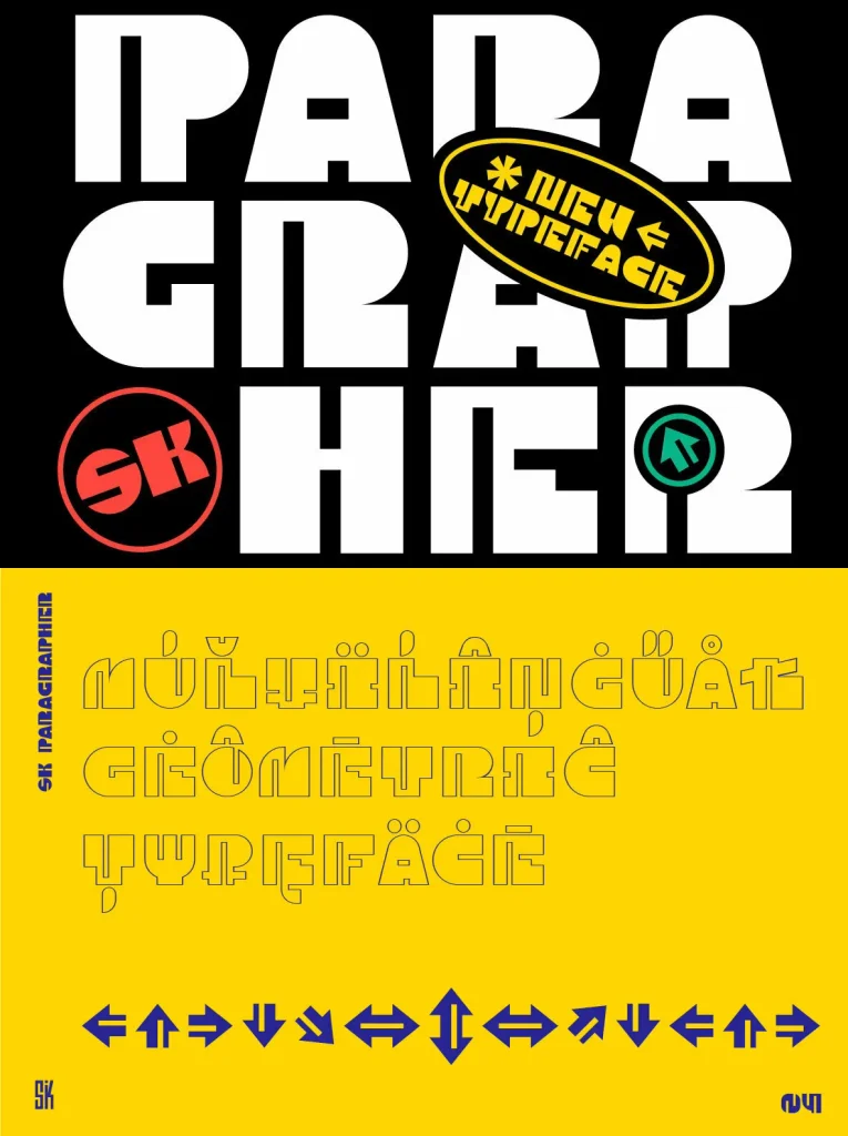
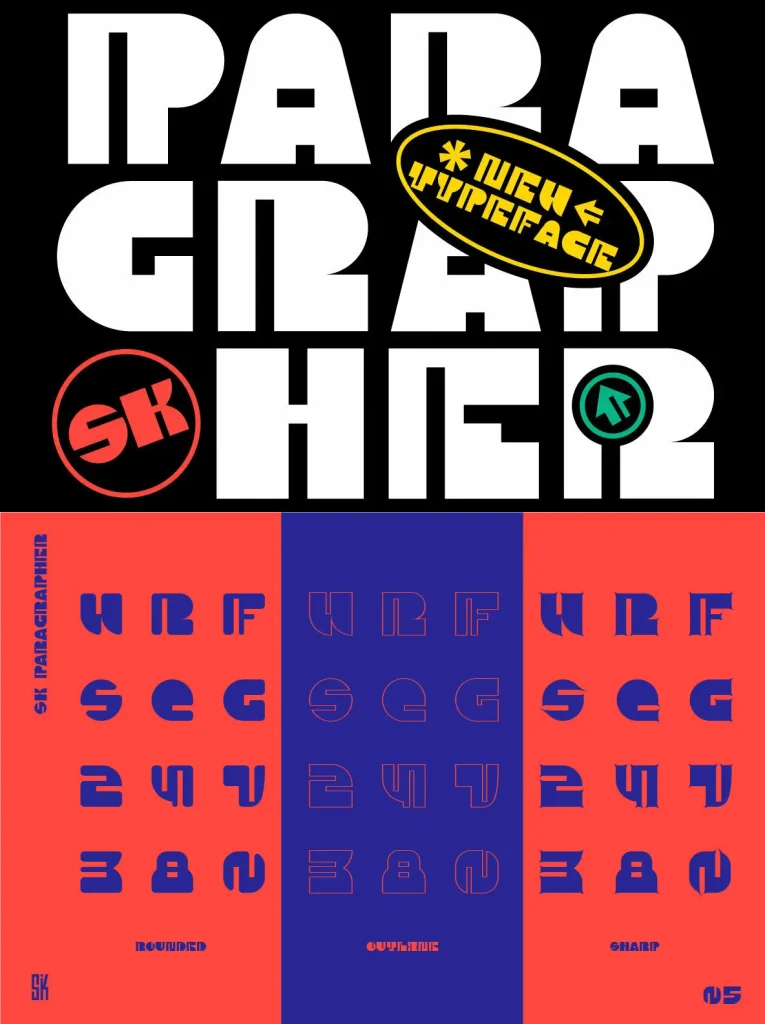
Designed by Shriftovik Type Foundry, the family includes both uppercase and lowercase letters, as well as a capital. It supports multilingual typography with extended Latin and Cyrillic characters, additional characters, and Hebrew. You also get more than 10 currency symbols, plus four fonts—Solid, Outline, Rounded, Sharp. With almost 1000 glyphs, SK Paragrapher suits design work across posters and websites.
Fonts
Solid
Outline
Rounded
Sharp
Language Support
Extended Latin, Cyrillic, Hebrew