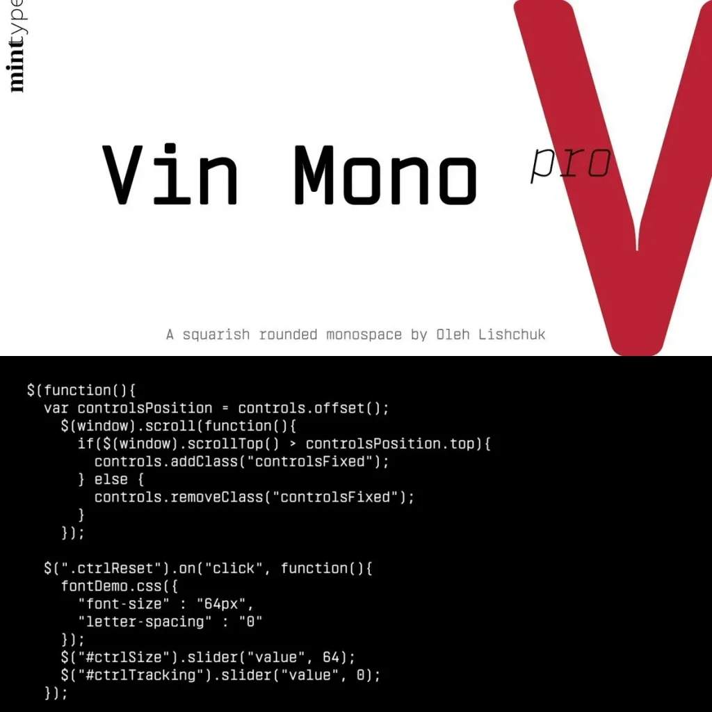
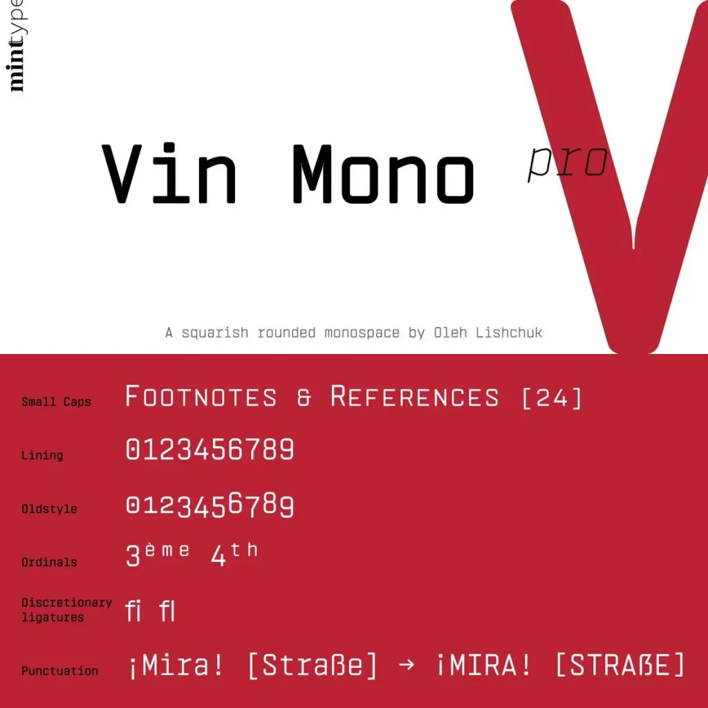
Vin Mono Pro: Squared rhythm, confident voice
A superfamily by Mint Type, Vin (translated from Ukrainian as “he”) brings a distinctly masculine tone through pronounced vertical stems and rounded corners. Across all three typefaces, a very large x-height gives the family added expression and assertiveness—well suited to design work that needs clarity, presence, and a firm typographic stance.
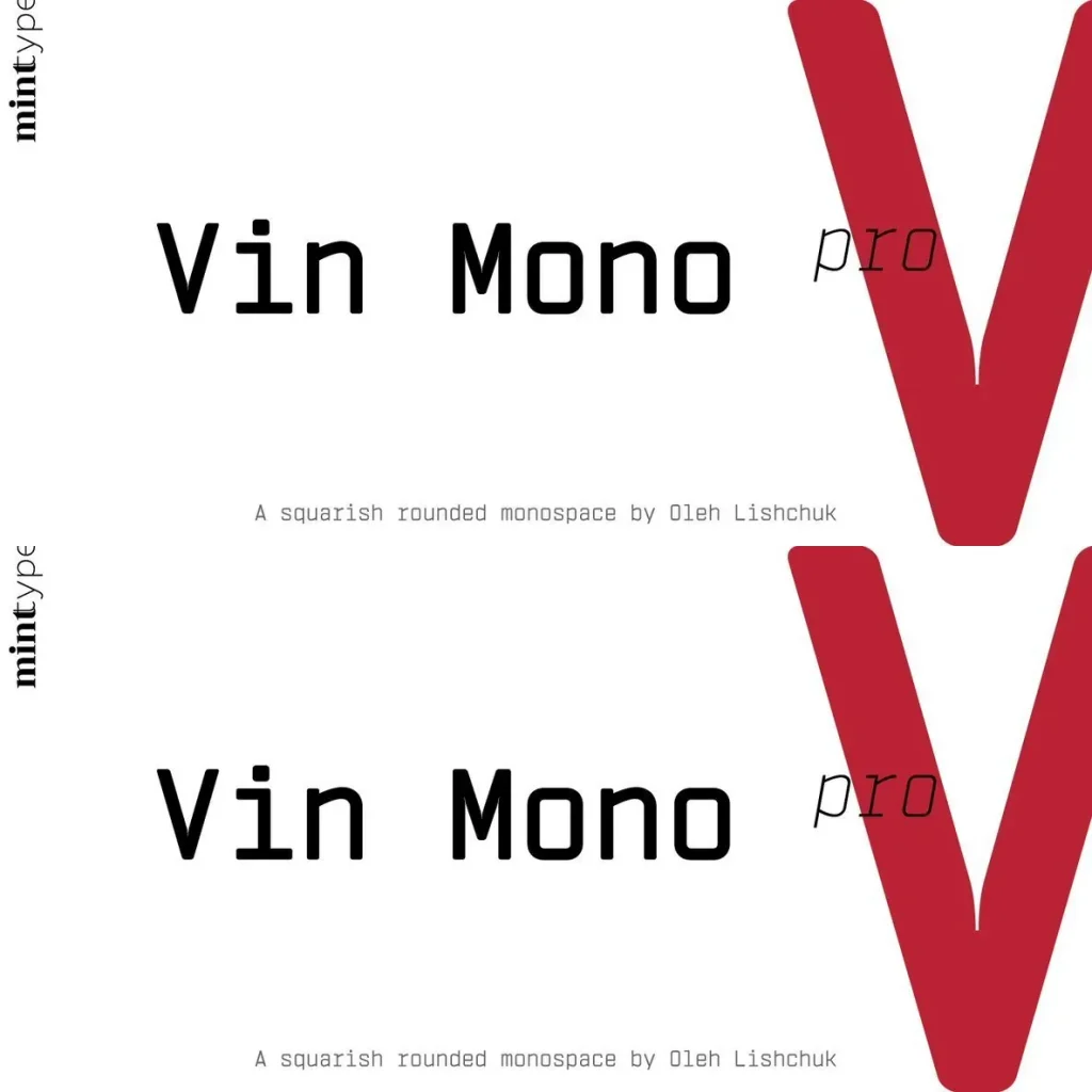
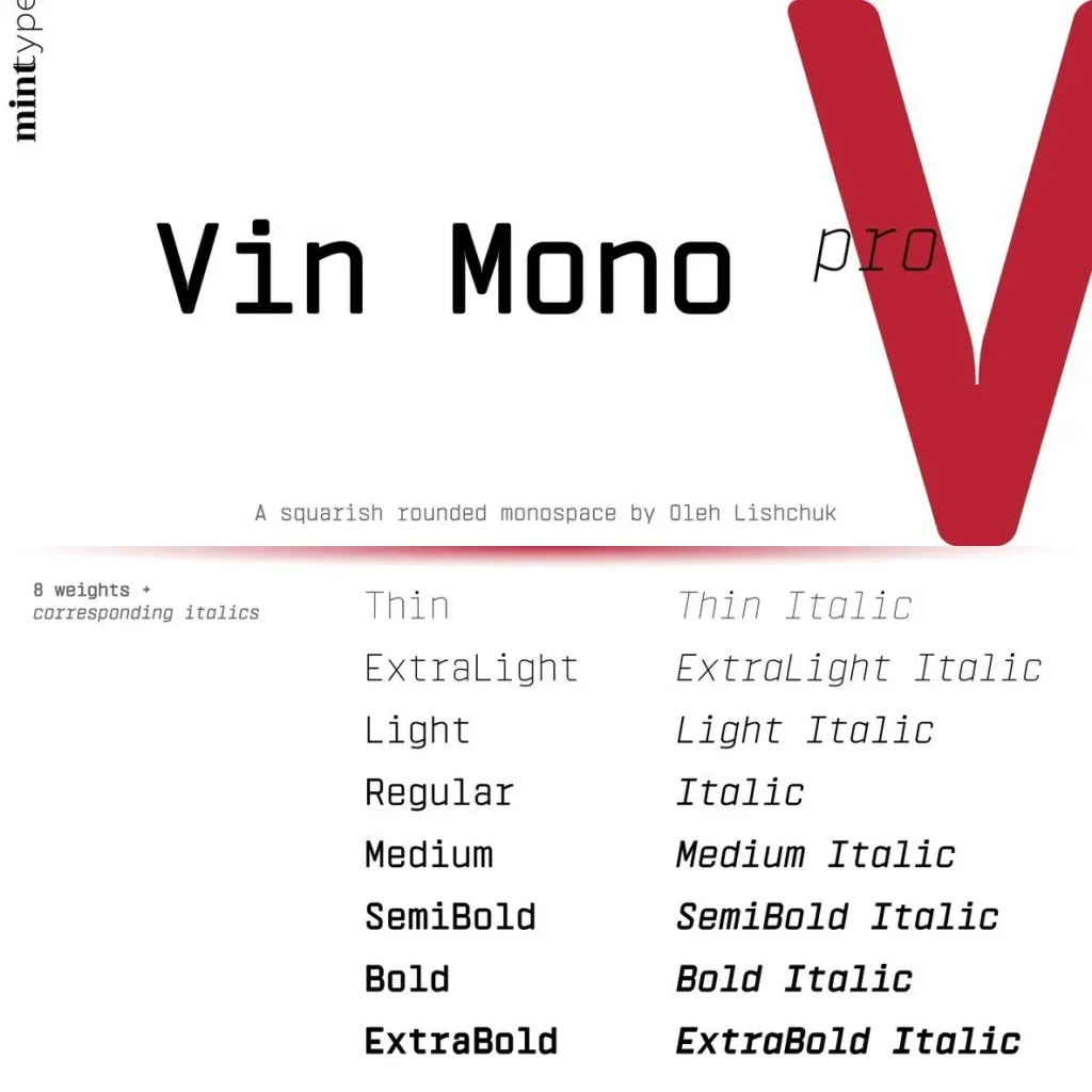
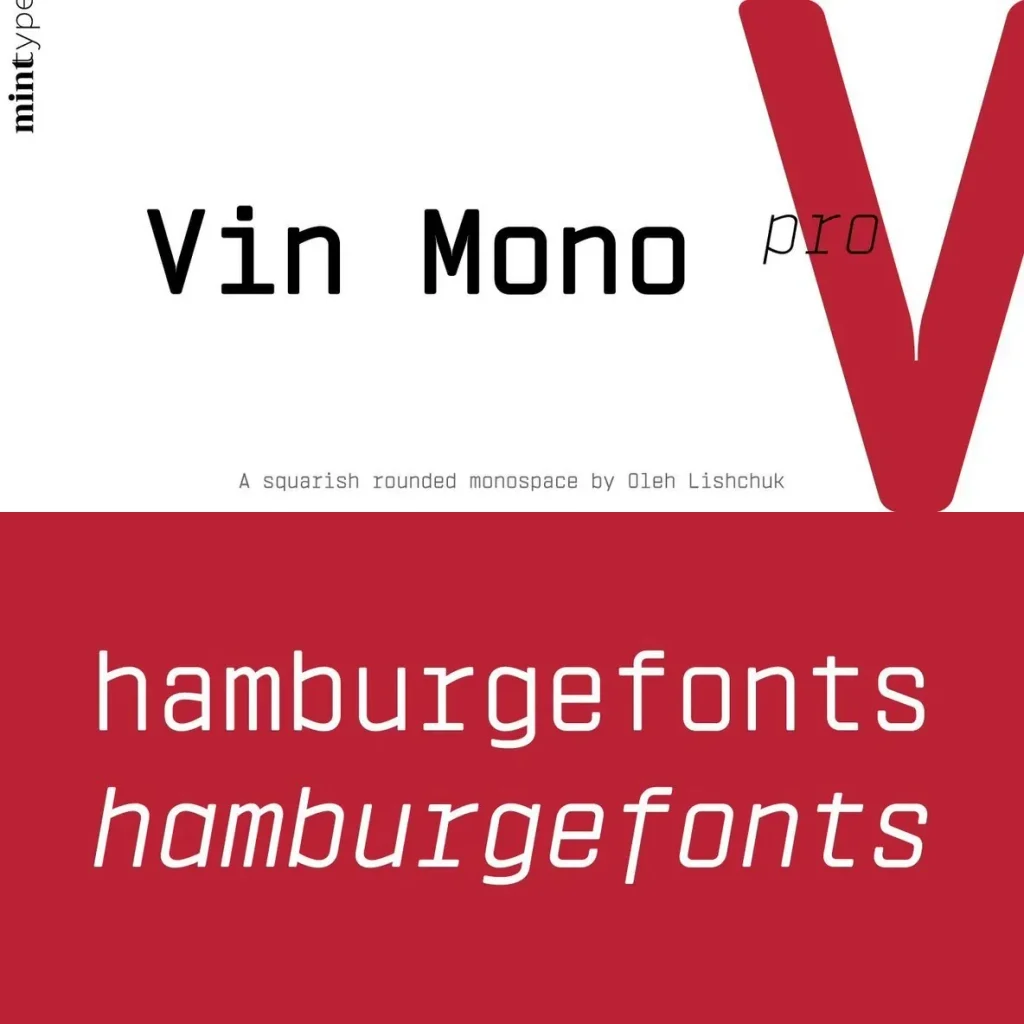
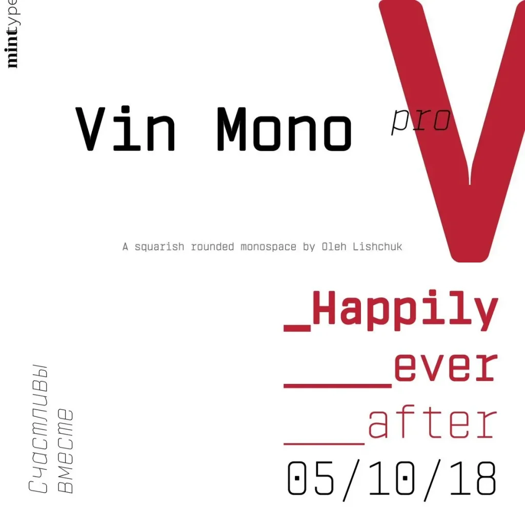
Vin Mono Pro is the monospaced member of the Vin superfamily. It takes on a squarish structure with an extra-large x-height and rounded corners, balancing strict spacing with a personable finish. Straight elements remain evident throughout the design, even within horizontal stems, giving the face a steady, technical cadence for interfaces, code-forward layouts, and contemporary editorial typography.