403 Monosuke — Order, Clarity, Restraint
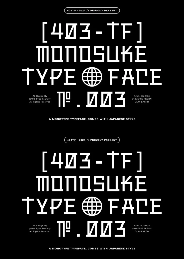
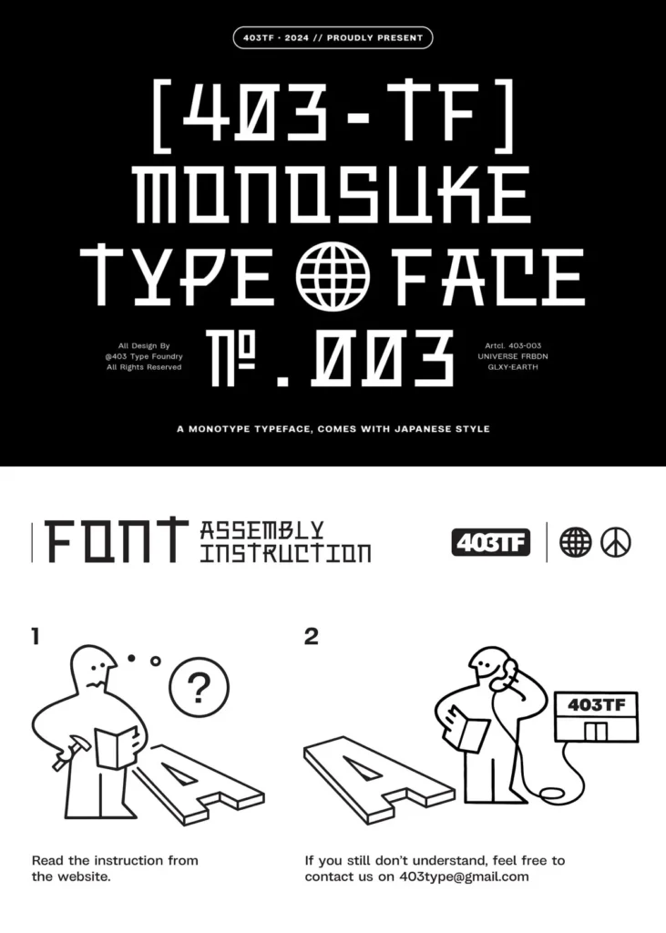
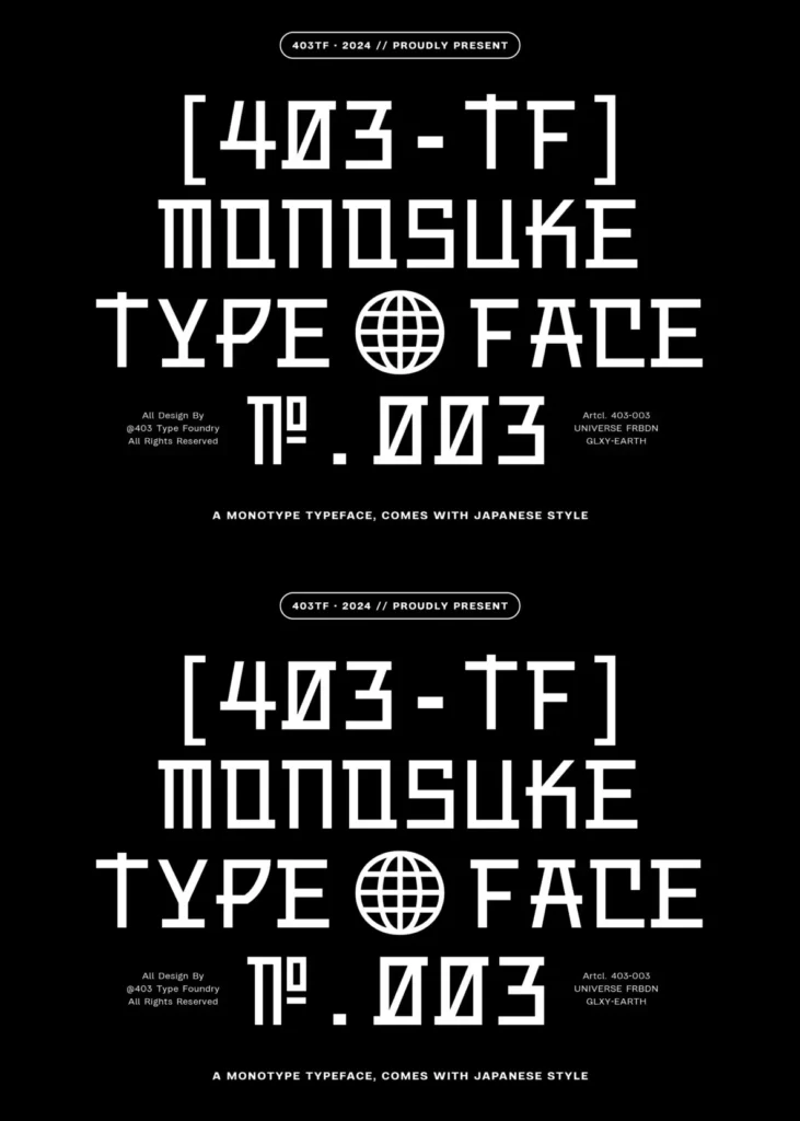
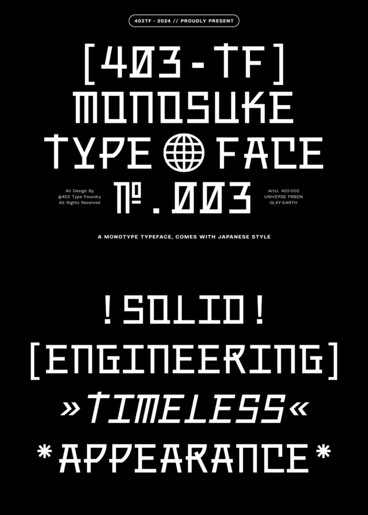
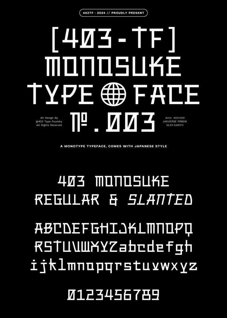
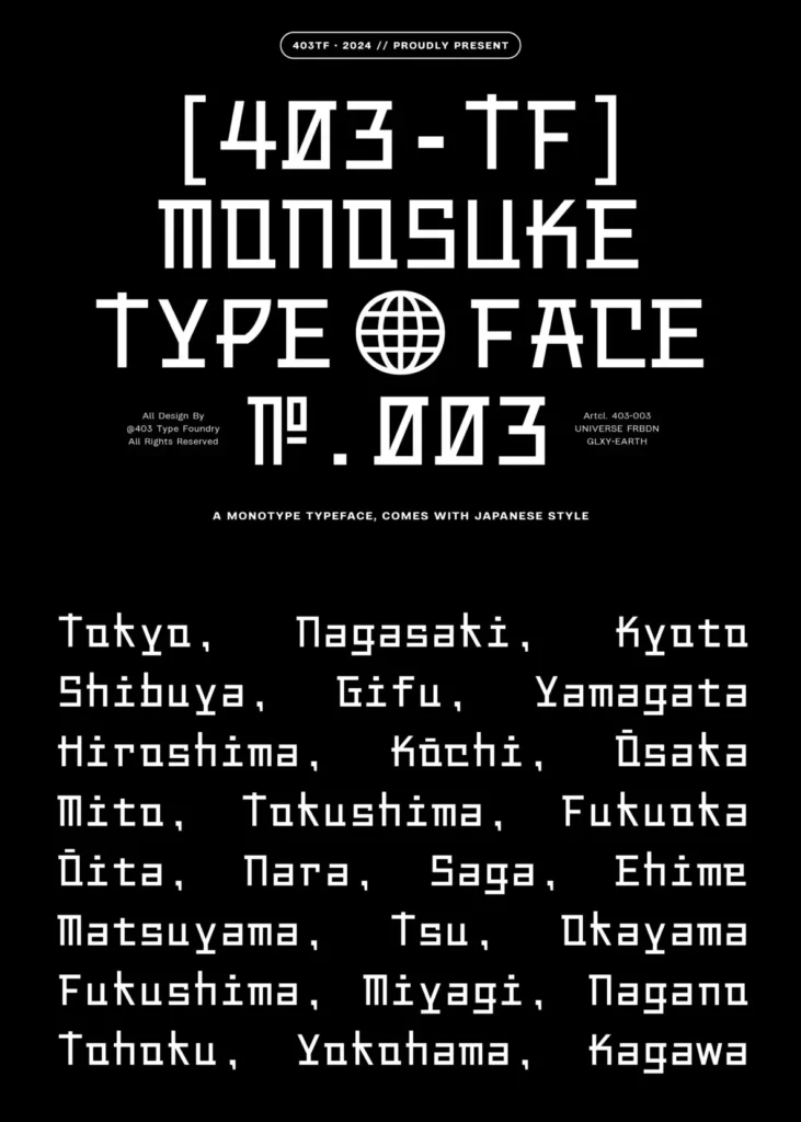
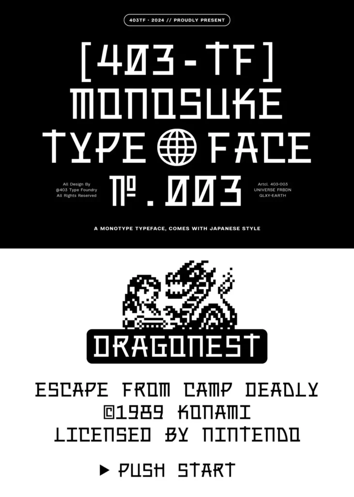
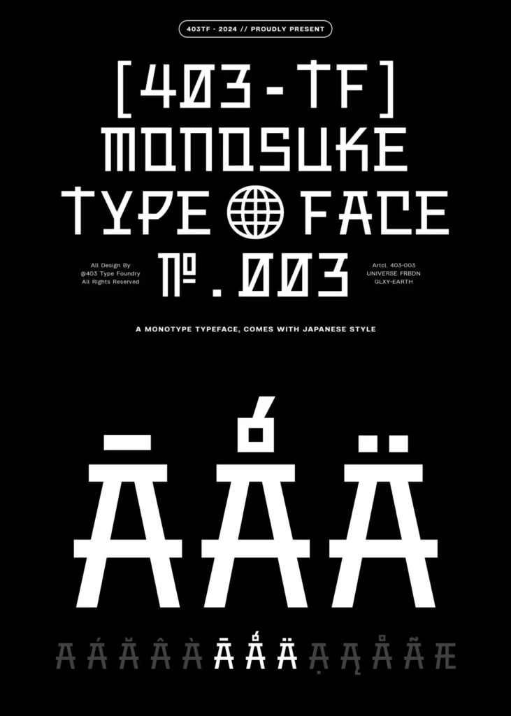
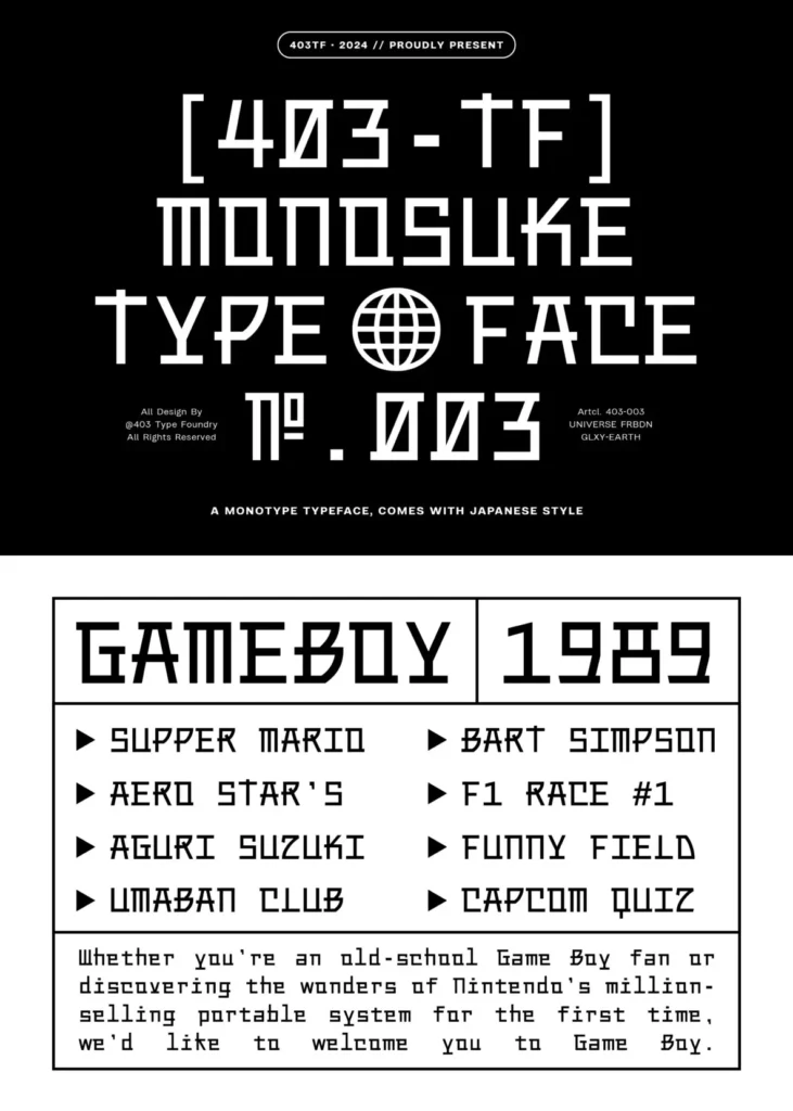
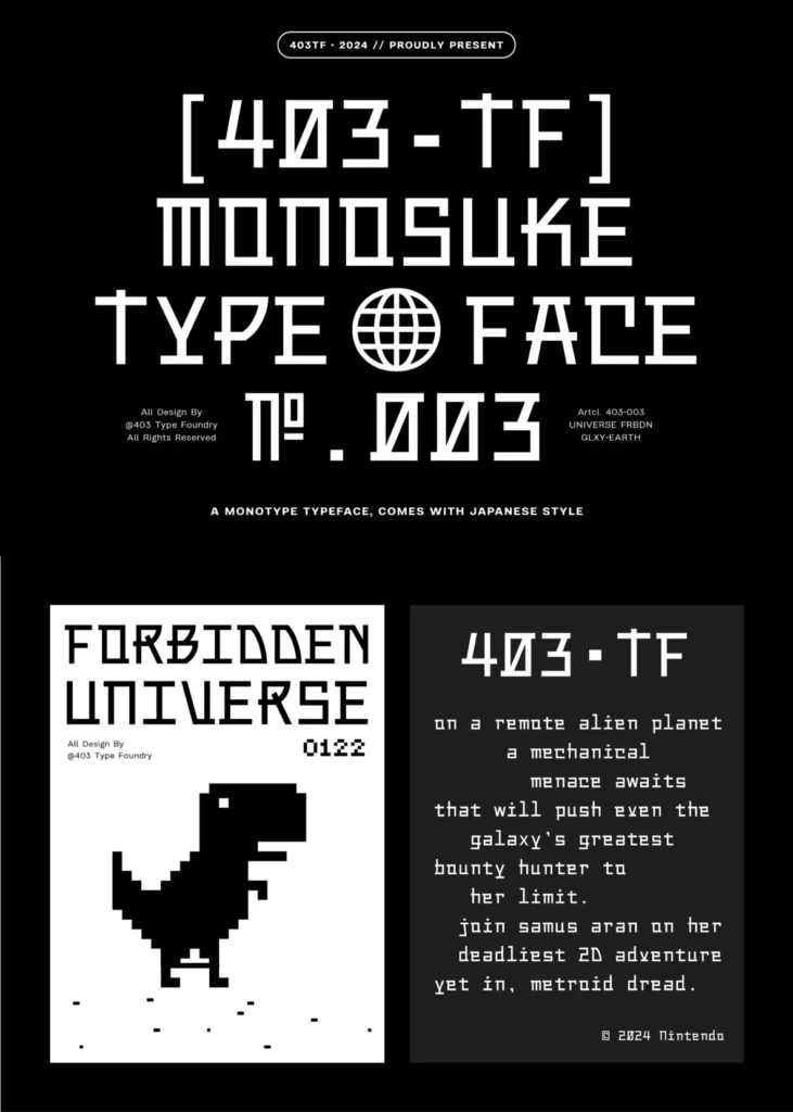
Inspired by the minimalist aesthetic of Japanese design, 403 Monosuke offers a contemporary take on the classic monospaced typeface. Clean lines and consistent character spacing create a clear rhythm on the page, with a sense of order that recalls traditional Japanese typography.
Its single-weight design may feel focused in projects that need a wider range of typographic contrast, but that limitation also reinforces the typeface’s direct, disciplined character. The inclusion of both regular and slanted styles adds flexibility for code-like layouts, editorial side notes, interfaces, and precise typographic systems. 403 Monosuke blends modern design sensibilities with the quiet, timeless elegance associated with Japanese aesthetics.