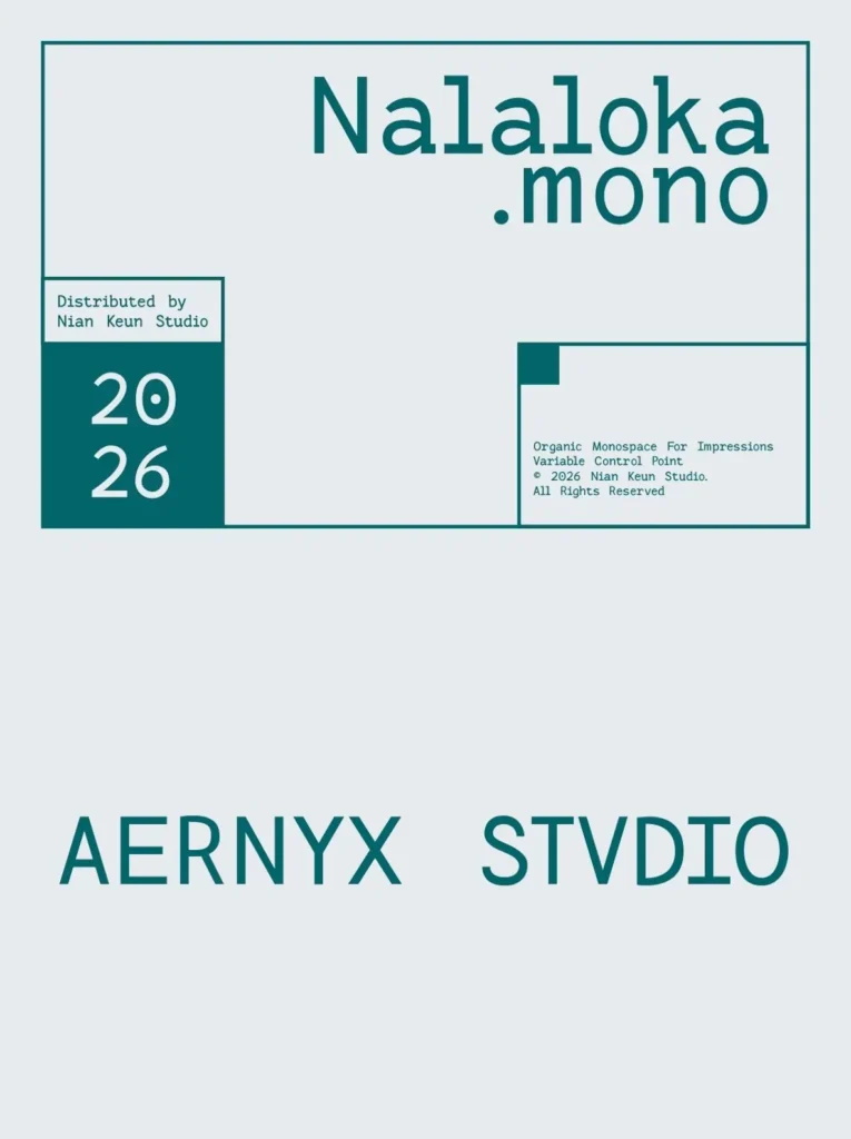
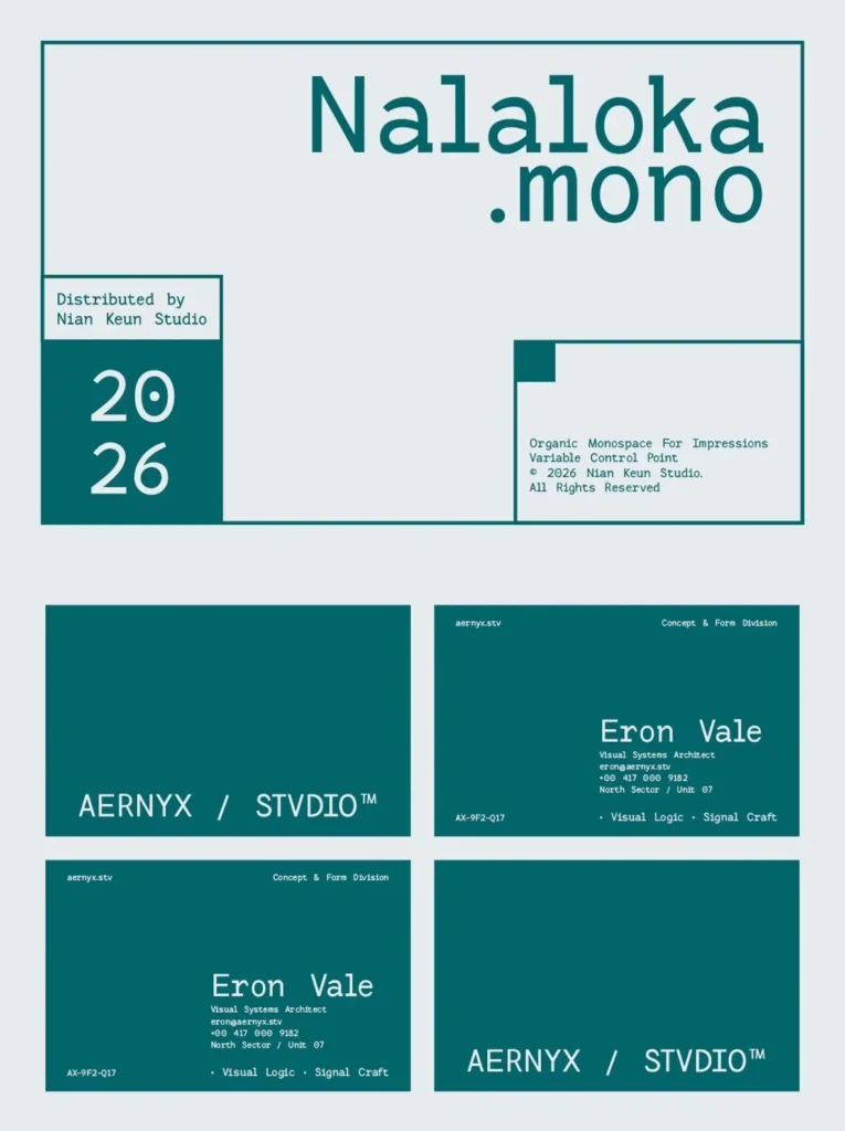
Nalaloka Mono: Modern Monospace With Organic Warmth
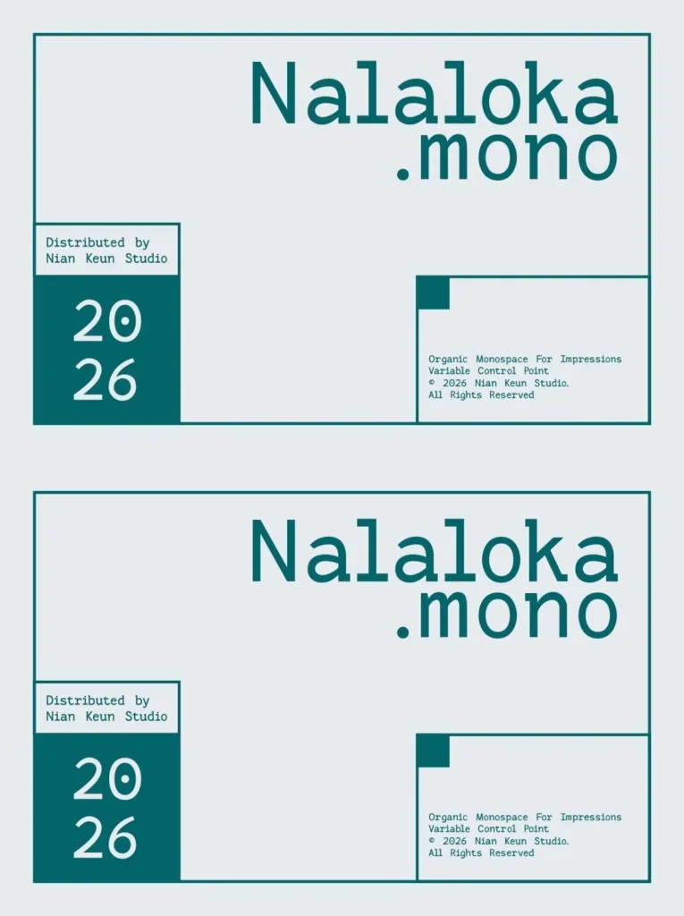
Nalaloka Mono is a modern monospace typeface that pairs disciplined spacing with an organic, expressive surface. It reads with the steady rhythm designers expect from a monospace font, yet avoids the sterile tone that can flatten a layout. The result is a contemporary voice—technical enough for systems work, warm enough for editorial—built around clarity, proportion, and a subtle human edge.
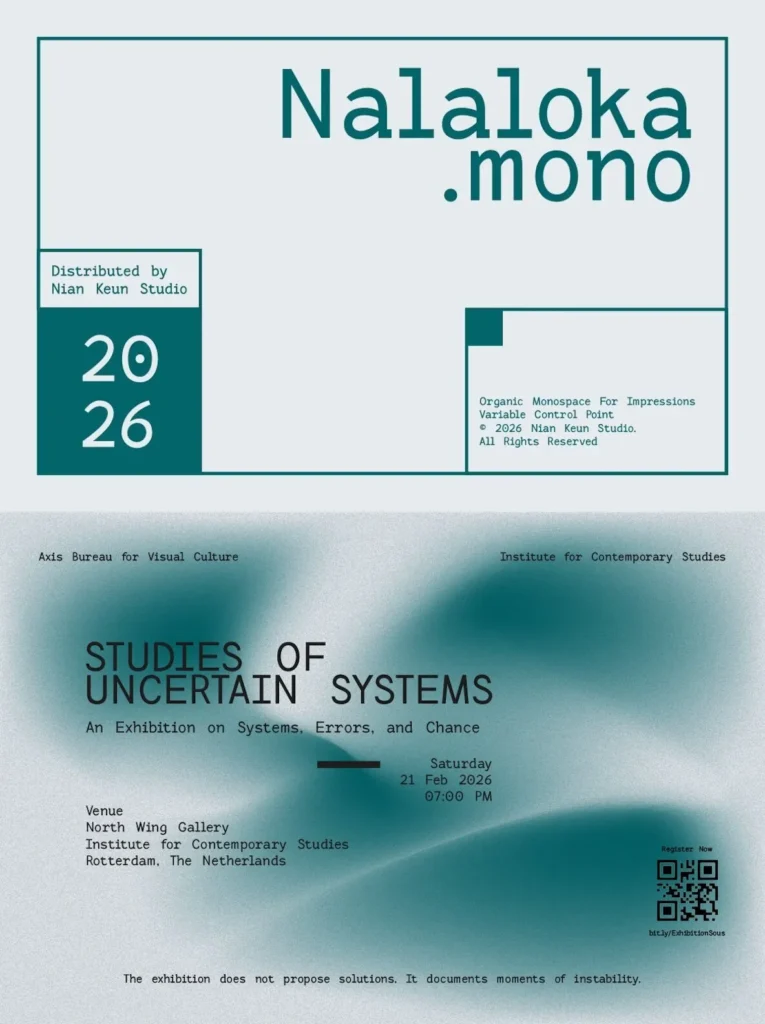
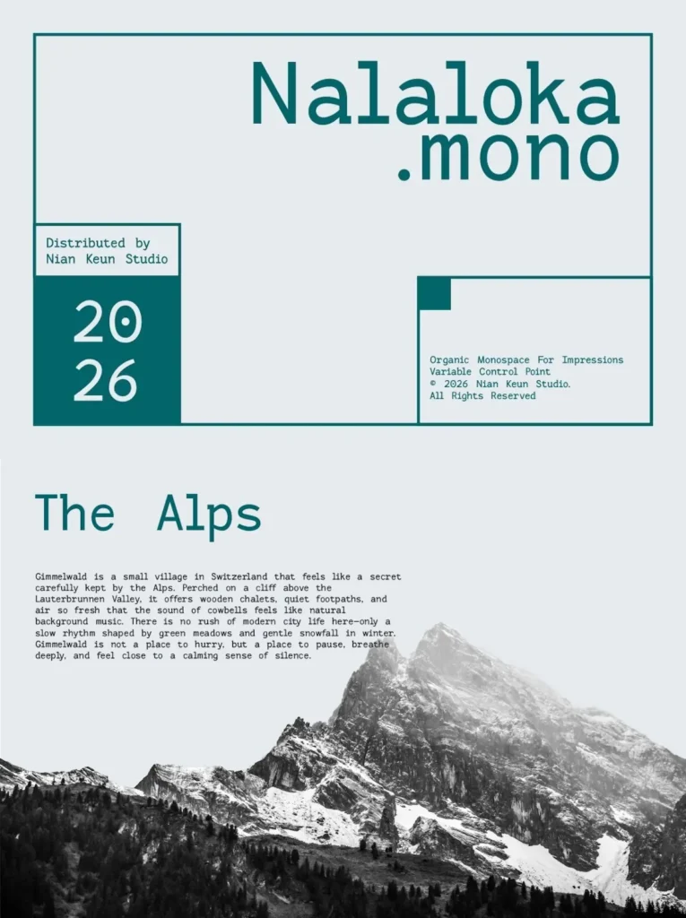
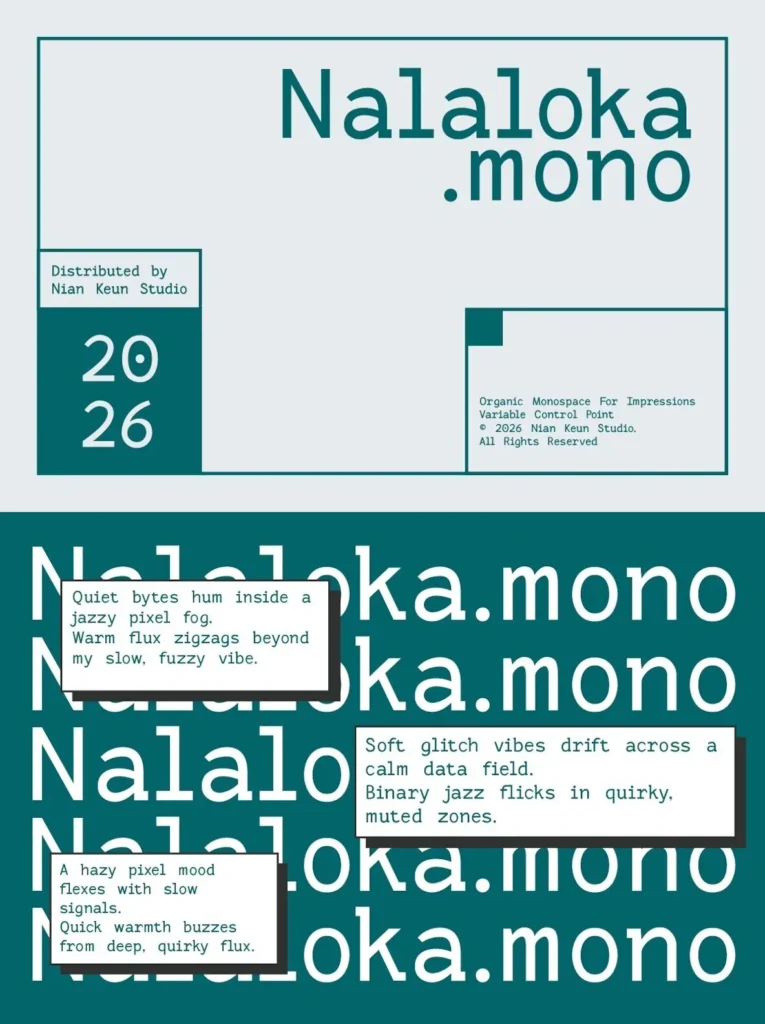
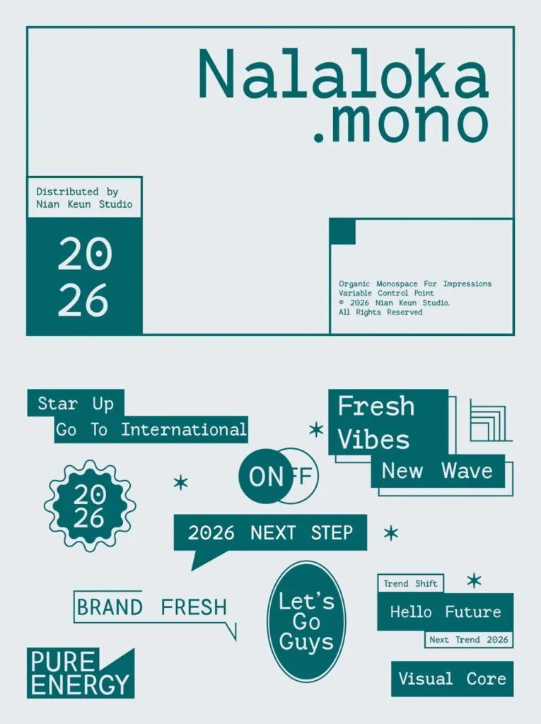
Across applications, Nalaloka Mono stays legible and composed. In editorial design, it holds long lines without fatigue and brings structure to captions, folios, and sidebars. In posters and visual experiments, its consistent metrics give you predictable alignment while the letterforms carry enough character to stand on their own. For branding and visual identity, it supports marks, lockups, and supporting typography when a monospace typeface needs to feel deliberate rather than purely utilitarian. On screen, it suits UI and UX environments where clarity matters and typographic personality must remain controlled. Nalaloka Mono also works naturally in coding-style layouts, terminal-inspired compositions, and grid-driven publication systems, where dependable spacing keeps the typographic architecture intact.
Features:
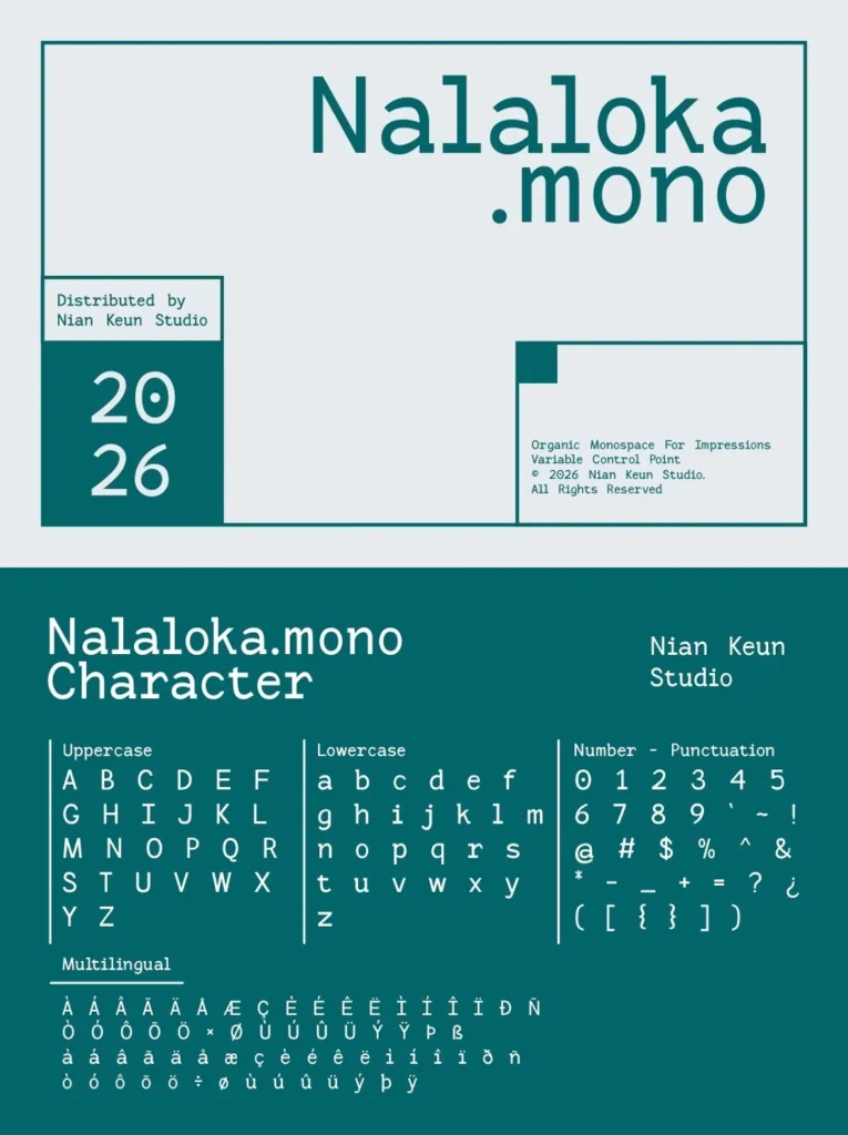
Monospace spacing for consistent alignment across columns, tables, and modular layouts
Clean, modern structure designed for readability in print and digital interfaces
Organic detailing that adds character without distracting from information hierarchy
Flexible tone suited to editorial layouts, posters, branding systems, and conceptual typography
A balanced monospace font option for designers who want systematic order with a human feel
Nalaloka Mono suits teams building design systems as well as individuals composing one-off pieces: it behaves predictably under constraint, and it holds attention when placed in the foreground. If you need a modern monospace typeface that feels systematic yet approachable, Nalaloka Mono offers a steady typographic backbone with just enough idiosyncrasy to keep the page alive.