Monocle: Orderly Type for Precise Settings
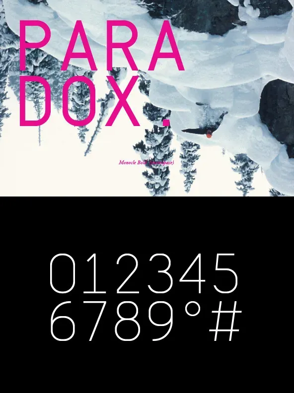
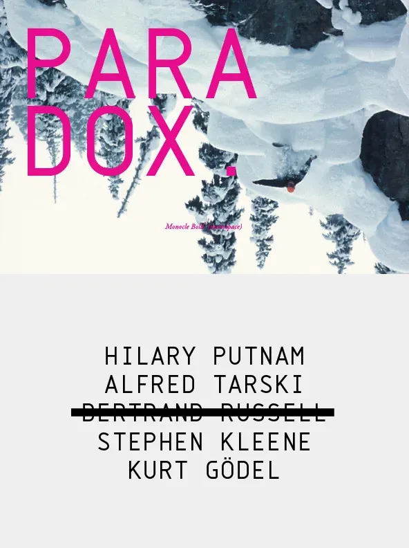
A clean, contemporary monospaced geometric sans, Monocle excels in titling, data, and numerical settings thanks to its clear, systematic design. The capitals-only format increases harmony between letter pairings and avoids the irregularity often found in mixed-case fixed-width typefaces. It reads with the steadiness expected of a neutral sans, while maintaining a disciplined presence suited to structured layouts.
Its geometric foundation is especially evident in the constructed round forms, giving the design a consistent rhythm across headings and technical typography. Multiple stylistic sets let you swap individual letters to fine-tune text settings for a more custom type solution. Designed by Reserves, Monocle supports professional workflows where clarity and authority matter. Requires an application with OpenType and/or Unicode support.
Features include
Basic Ligature set including ‘f’ ligatures (ae, oe, fi, fl, ff, fh, fj, ft, tt, th, ct, st)
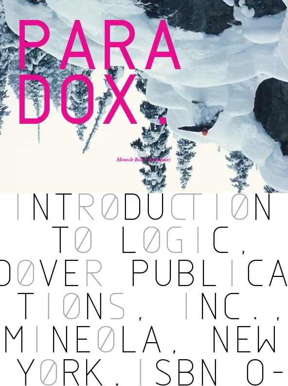
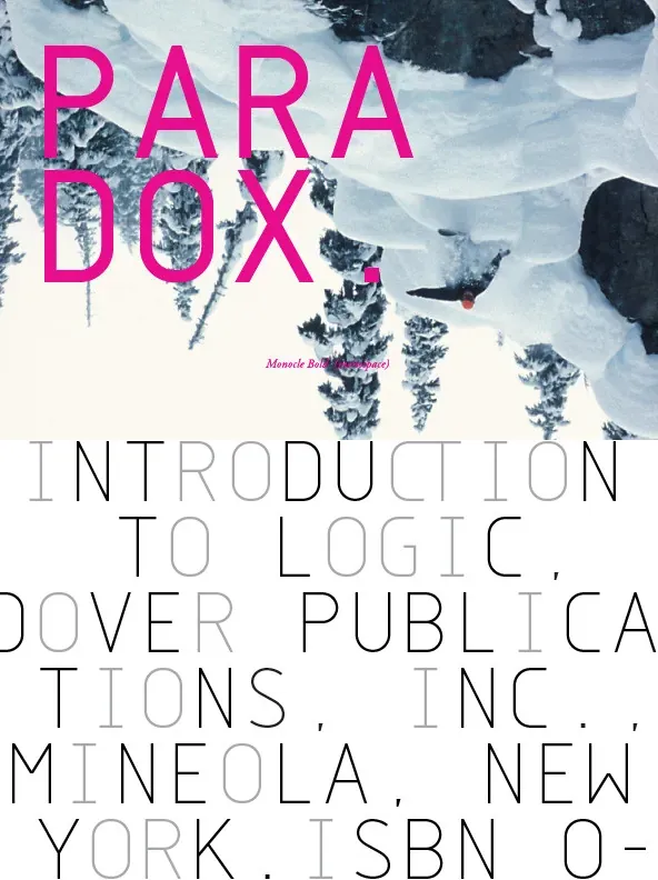
Alternate characters (O, I, S, G, R, Q, _, $, ©, , ?, %)
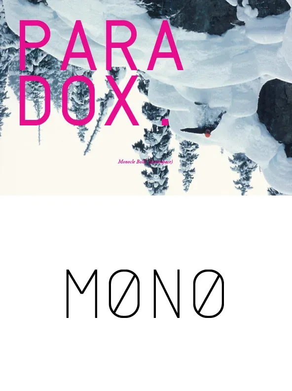
Slashed zero
Full set of numerators/denominators
Automatic fraction feature (supports any fraction combination)
Extended language support (Latin-1 and Latin Extended-A)