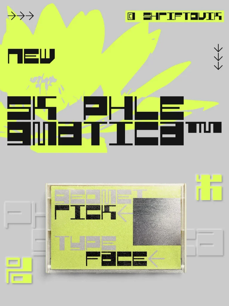
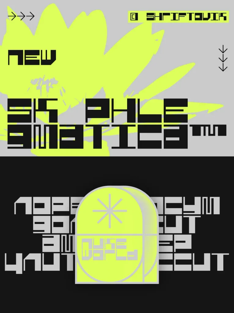
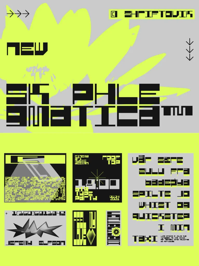
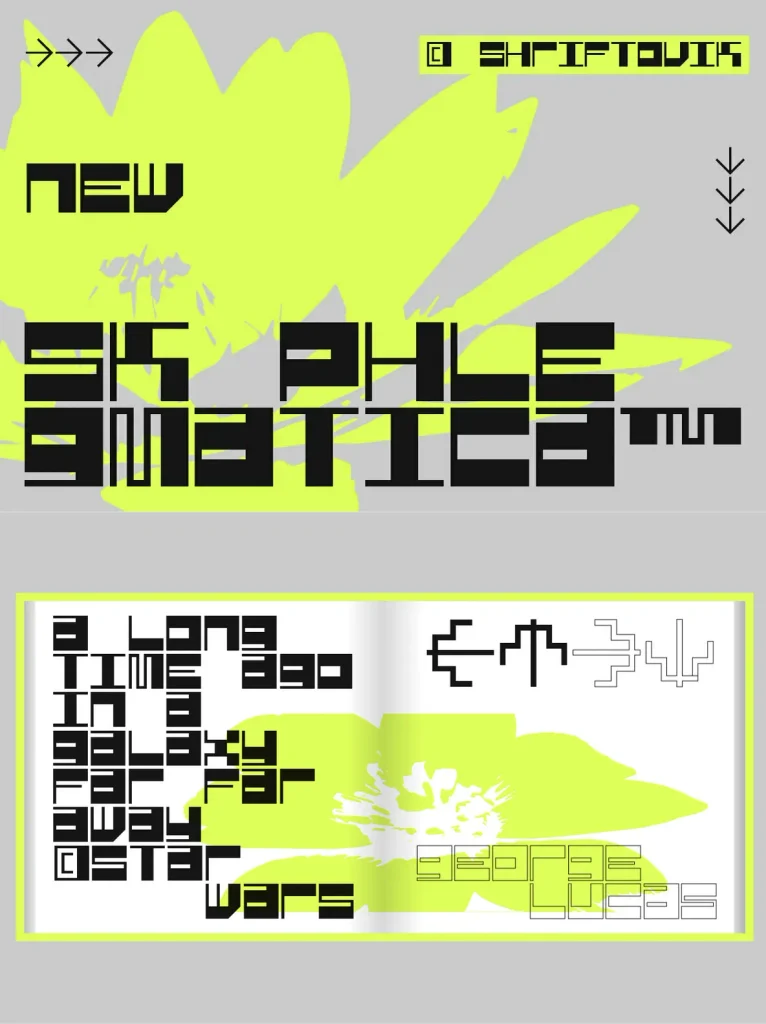
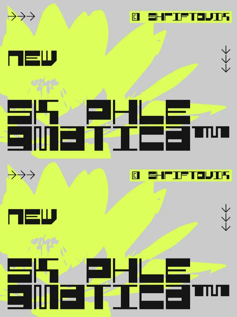
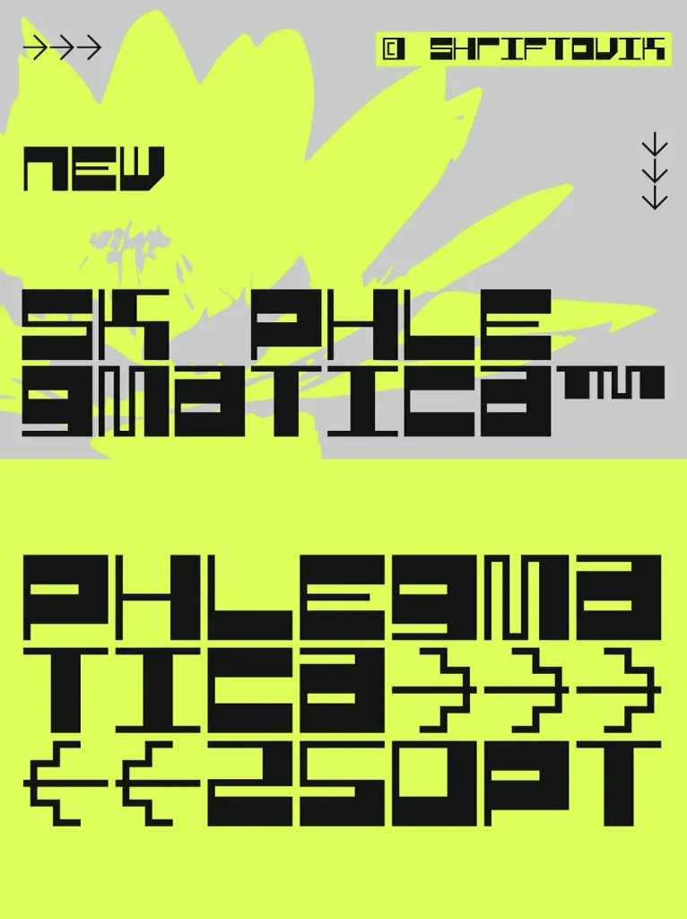
SK Phlegmatica: Industrial weight, precise rhythm
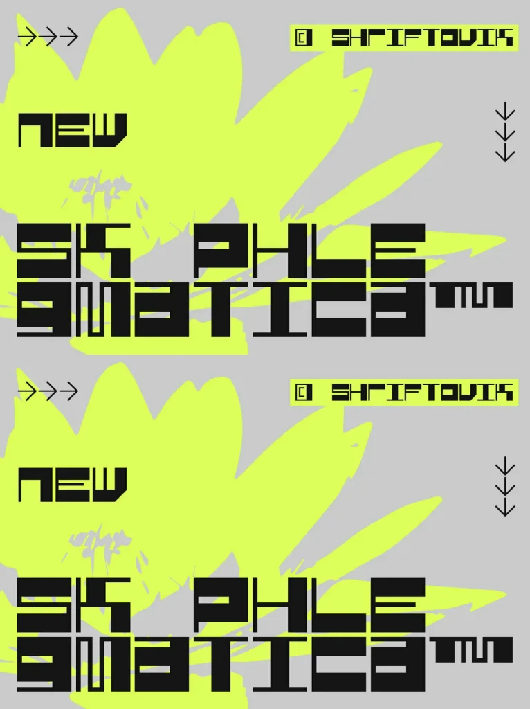
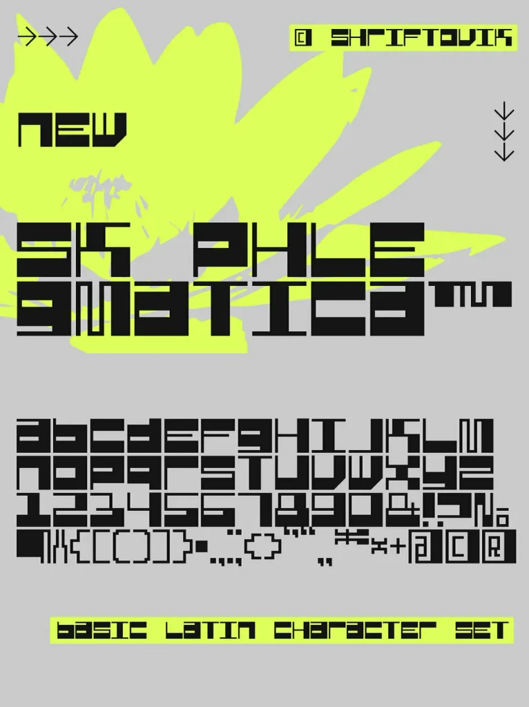
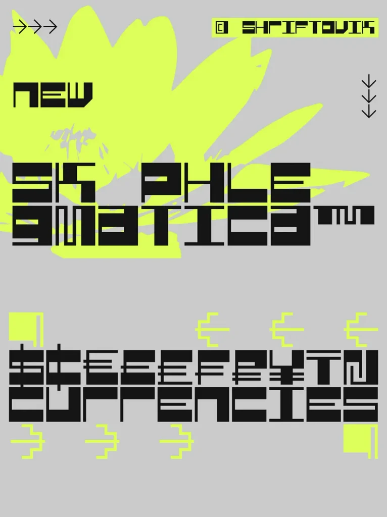
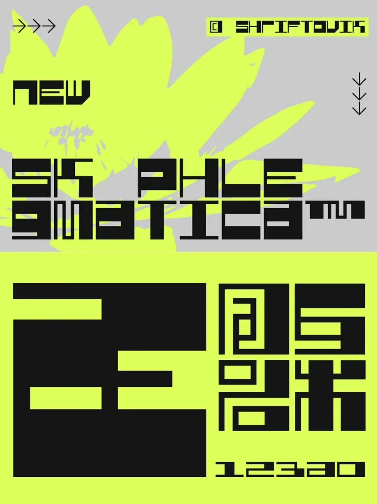
A heavy geometrical grotesque with an industrial spirit, designed by Shriftovik Type Foundry. The design is built on a clear contrast between thin and wide lines. That contrast creates distinct frames inside each glyph and leaves space to test different symbol rhythms. The result is monumental, with a steady cadence that forms a recognizable pattern across the text line.
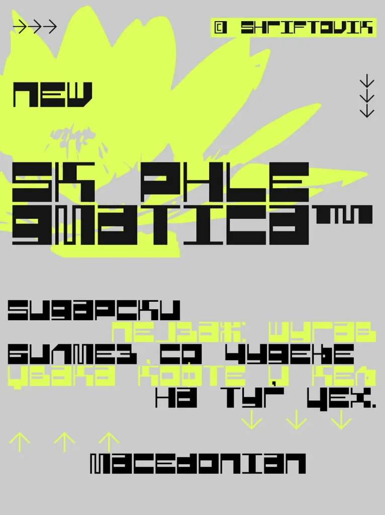
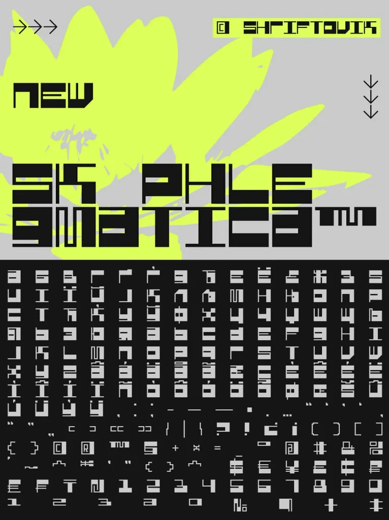
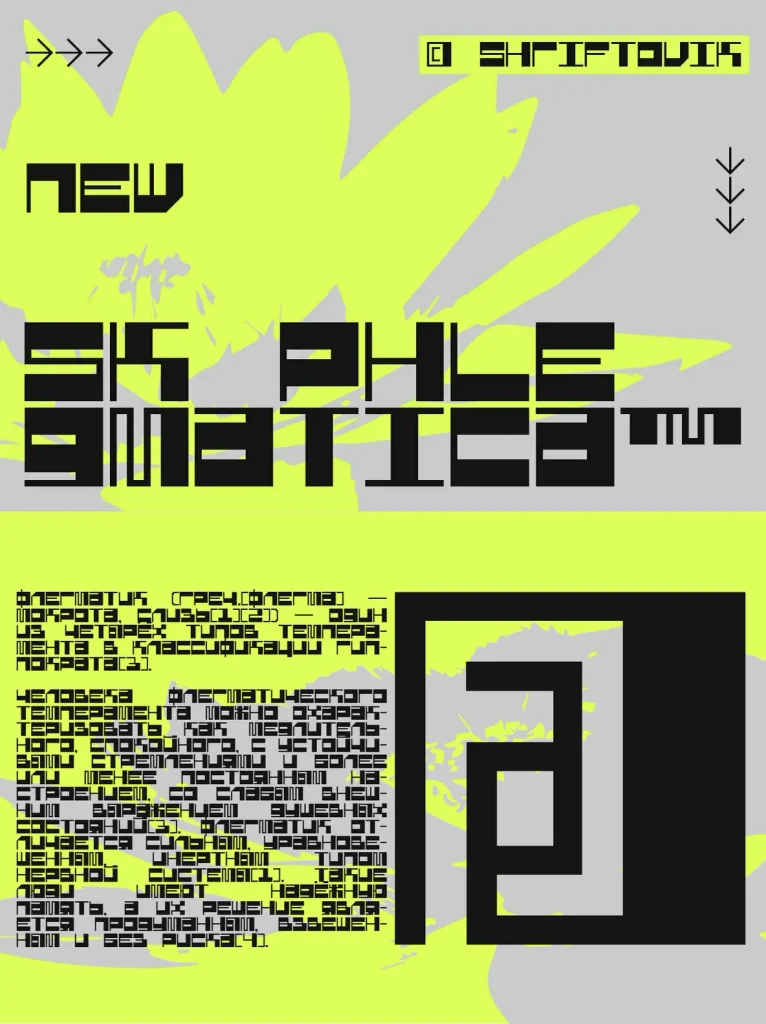
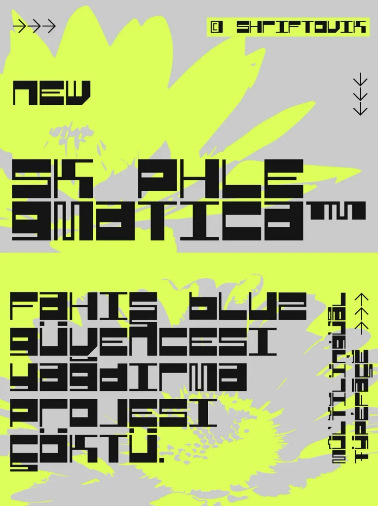
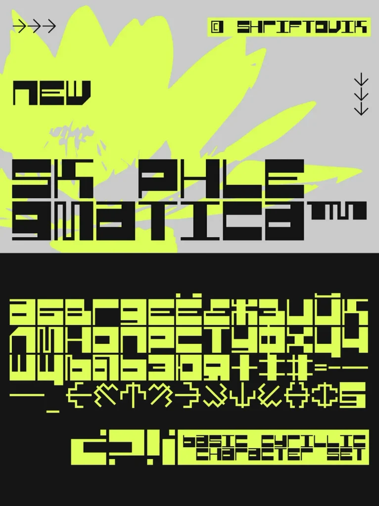
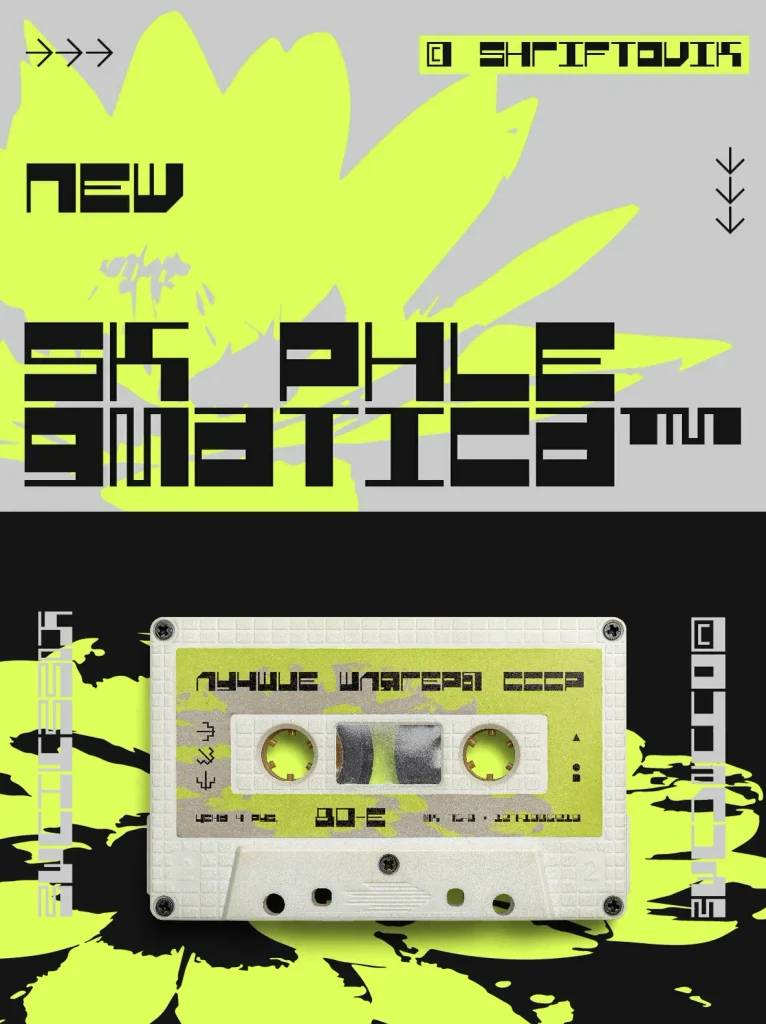
Alongside its visual character, it offers practical advantages for production work. SK Phlegmatica is a monospaced multilingual typeface that supports more than 100 Latin and Cyrillic languages. Use it to highlight titles, set posters, and build web design systems where rhythm, structure, and consistency matter.